I've built for the web since 1998, and I've picked up its new material first every time it changed: HTML, then blogs, then apps, then React, now agents. I run the design system behind Cisco's network administration products and the three teams that build with it. In March we went fully agentic. This site is what that looks like. The medium changed again, the way it did in 1998, 2005, 2007 and 2013, and the move is the same as it's always been: learn it by building something real in it.
In March my team at Cisco was told it was turning entirely to agentic development, and I chose that moment to start working with Claude. I now run all three of our teams. At Cisco the work is the design system and the people who build with it: opening it to agents, putting agents on a schedule with guardrails, and running three teams with a system that drafts while I decide. At home it's the same way of working on things I care about: the racing rig, tracks built from real roads, an open protocol for how AI should talk to people, and this site.
Replies9,984
Days56
Most in a day2,100
Jul 2Oct 13
My use of coding agents, a day at a time, July 2 to October 13, 2026: 9,984 replies over 56 days. Quiet days are gaps of real time.The most, 2,100, on September 29.
Large language models, coding agents, the Model Context Protocol, agentic development.
At Cisco
Built a tool with agents for my talks in which structure and presentation are layers of one piece of work, viewed from either angle: the outline, or the live deck that exports to Keynote. told in the argument is the source of truth
Put agents on a schedule, with guardrails: a page of what's rolling out every weekday, and a draft of my Monday leadership update, both read-only and dry-run unless I say otherwise. told in agents on a schedule, with guardrails
Built the system I run three teams with: it reads the work where it happens, says how fresh and how sure every answer is, and drafts while I decide. told in a harness, not a dashboard
Opened our design system to coding agents: a generated manifest of every component, served to agents over MCP, so they read the system and use it the way our developers do, with a one-click setup for designers. told in a design system agents can read
My team, which builds the design system behind Cisco's network administration products, turned entirely to agentic development. I chose that moment to start working with Claude, and I've since taken on all three of our teams: the design system, the modernization of the existing dashboard, and the JavaScript platform under both. told in out into the open
Rebuilt KPT ShatterBox, the 1995 Illustrator filter I used as a designer, for Illustrator 2026, with an MCP server so agents can shatter artwork. It's the seed of the field behind this site. doooom-shatter on GitHub told in the 1995 filter
Took the cloud out of the racing system on purpose: once the racing service shipped its own tools and changed how outside apps sign in, a hosted version was the wrong bet. Racing Desk runs for one driver on one rig. told in the racing rig
Made the first commit of a telemetry plugin for my racing rig. By May it was a motorsport information system: a live HUD, race recording, and a dashboard that says whether tonight is a good night to race. prodrive-plugin on GitHub told in the racing rig
beta.alternate.org: one dark, three-column portfolio page. Portfolio of Kevin Conboy Next.js, headless WordPress, Adobe Fonts. Archived 2026-10-13
At Cisco
Slides are where talks go to die. In September 2026 I built a tool with an agent in which a talk is one piece of work with two layers, its structure and its presentation, and I can look at it from either angle: as an outline, premise to arc to beats to sequence, or as the live deck, which exports to PDF, PowerPoint or Keynote. The first talk through it is about my three teams, and the metaphor is a superconductor.
For a few years I gave the monthly release talk to a couple hundred engineers, and a longer one when the teams needed a story. In 2023, a talk on visual flow to the developers building with the system. In 2024, a series teaching React to designers and developers who didn't think they were React people. The people in those rooms are the ones the design system is for. I found out how those talks had landed from the private messages afterward, from people I didn't know.
The way I'd made the decks for twenty years was the way everyone does: open the slide app, make a title, lose the argument by slide nine.
The fix was to stop treating the slides as a separate thing. A talk is one piece of work. Looked at from one angle it's structure: the premise, the one sentence the talk exists to make true; then the arc, then the beats, each with a stable id, then the sequence. Looked at from the other it's presentation: the slides themselves, live in the browser. Both views edit the same talk. I reorder and rewrite in either, gather images with their credits, and the other view is already current.
The presentation layer carries my rules, written down: one idea per slide, the second line is the loud one, real photographs and real interfaces, never decorative illustration, no gradients, mostly empty slides, Merlin Mann's pacing. It lives as HTML, because the browser is where I design, and exports to PDF, PowerPoint and Keynote because the room doesn't care where I design.
The talk in progress as I write this is about the design system's teams, and the metaphor is a superconductor: resistance drops to zero below a critical temperature, and current flows without loss. The premise underneath it is the one I've been giving since 2001, when I built a web page in five kilobytes: performance is experience. Speed is not a feature of the thing. It's what the thing feels like.
Nobody writes their own presentation software. It's a solved problem with a thousand products and all of them start from the slide. Describing the system I actually wanted, where structure and slides are the same talk seen two ways, took a weekend with an agent, because the agent could write the views, the exporters and the Keynote adapter while I argued about the beats. (The Keynote adapter is still arguing back.)
The tool you build for yourself encodes what you believe. This one believes in a unified design process: structure and presentation are layers of one piece of work, viewed from different angles. Now it's a skill file.
In late August 2026 I asked an agent how a rollout-tracking page should even work: a script I run by hand, or something it runs for me? Two days later it was a small, tested service publishing to the page the team already reads. Since September it has run every weekday. A second agent drafts my Monday update to leadership from the week's evidence.
The first agents I trusted to run while I wasn't watching were the two with the least to gain by lying.
The rollout page. My modernization team moves the existing product onto the new design system page by page, behind feature flags. Someone had asked, months earlier, for a way to see how far along each page was. I asked an agent how I'd even architect it, and by the next evening there was a small service that reads the flags, works out each page's stage from what production is actually serving, and publishes a table to the page the team already reads.
The agent's first draft treated a flag being on as a page being done. A reviewer on the team, one of the engineers doing the page-by-page work, caught it within a day: the table said done, and they knew the page wasn't, because they were still on it. They didn't file it as a bug. They explained what done means to the team, and the stage logic was rewritten to follow the team's own definitions of work-in-progress, alpha, beta and generally available. The page also de-emphasizes who flipped which flag, because a rollout dashboard is not a leaderboard.
Then I asked for it on a schedule, because I wouldn't remember to run it and I wanted a log. So it runs every weekday morning, verifies the page updated, writes a line to my notes only when something materially changed, and asks me before it touches credentials or code. It missed a run once. The next day it recommended moving its own schedule into CI so it couldn't miss again. I took the advice.
The Monday draft. Every Monday evening my three tech leads post their week. I asked for a tool that could more or less write it for me on Monday evenings, so none of it would be a surprise to me. It assembles an evidence packet from the week, the activity journal, the repositories, my notes, read-only views of chat, meetings, email and tickets, and writes a draft in our order, plus notes only I see that map every bullet to the evidence behind it.
One rule in its instructions is the whole point: don't pad thin sections, don't turn activity into completion, and never infer that no work happened from missing evidence. A linked ticket is not a shipped feature. A quiet week is not an idle one.
Why schedule them at all? The chores from February were the chores I remembered to run. These are the ones I wouldn't. A dashboard I refresh by hand gets refreshed when I'm worried about it, and a Monday update written at 9pm is written from memory. The agent reads everything, every time, and tells me what it couldn't read.
The guardrails: read-only tokens kept in CI secrets, never in the repo. Dry-run by default; the live mode is a flag I set. Every run logged where I'll see it. And the editorial contract: evidence, not inference; coverage, not confidence; say what you couldn't see.
Whether the Monday draft is better than the one I'd have written, I don't know yet. I think so. I'll know when someone tells me something on a Tuesday that I didn't already know.
In the spring of 2026 an agent rendered a management desktop app into Figma from a sentence. By summer it read my meetings, chat, email, tickets and repositories into one place. In late August I noticed I was talking to it through the agent more than looking at it, and that became the architecture.
In the spring of 2026 I went from running one team to running three, and the hours didn't change. A manager's job is mostly knowing: who said they'd do what, what moved since Tuesday, which of the fourteen things on fire matters to the person who's about to ask. That person is usually right to ask, and they've been waiting since Tuesday too. I'd been keeping all of it in a sticky note and a very good memory, and the memory was full.
So I built the thing I needed, for one user. It started as one sentence to a design skill, asking for a desktop app that manages commitments, stakeholders, meetings and deliverables, which an agent rendered as real components onto a Figma canvas. Then it became an app, in our own design system, because I never ever want anything else. (That sentence is also a skill now.)
It reads where the work happens. Meetings. Chat. Email. Tickets. Repositories, issues, pull requests, releases. A directory, so names become people and people become teams. And my own notes, which is the durable store: everything it learns that's worth keeping becomes a note I can read without it.
It says how fresh and how sure. Every answer carries when its sources were last read and how confident it is. Advice older than a day or so is marked stale and left out. Missing evidence is never "nothing happened."
It drafts while I decide. A priority inbox ranked by who is asking and what they're waiting for. "What did I miss?" after two weeks away, answered as a page. Proposed work items from the quarter's goals, which I edit before they're created, after I caught it rolling several into one.
The first thing I asked it to do to itself was a security and privacy audit. It found unauthenticated endpoints and over-broad scopes in its own code, and I fed its findings back to it as review comments. That's a working relationship.
The pivot came in late August. By then there were three clients, native, web and desktop, and I was asking what the smartest way forward with one interface was. The answer was that the UI wasn't the point. I was talking to the system through the agent anyway. So the architecture flipped: a core with typed operations; a command-line tool that answers in a second without starting a server; the dashboard optional, for scanning. The agent is the interface. The dashboard is for when I want to look.
Nobody builds a product for one manager. There's no budget line for "a system that knows what I know." Built with agents, on nights, it's the most useful software I have, and it's taught me how my teams actually work.
What I'd hoped to learn, and what the agent confirmed, was how I use words to convey my entire idea: "Warm, direct, candid, and relationship-first." I'd rather it drafted in my voice than in its own. It does, now. I still read every word before it leaves.
What's not here, on purpose: anything about the people. The system holds their work. This page holds mine.
Designers ask the same three questions: how composable is this component, can product developers customize it, can I change the icon. In April 2026 I started a bot that answers them from our docs over MCP and says how confident it is. Within a week it was an app in our own components, and it took screenshots.
The support rotation on a design-system team is a person. Each week one engineer takes the channel and answers the same composability question a dozen times, politely, between their own tickets. It's necessary and it's a tax.
So I asked for a chatbot. The first version was a command-line thing. The second, a day later, was the ask I actually meant: an app, in our own components, talking to our MCP. Our React library for the interface, a small server behind it, seeded with real questions from the channel and tuned for designers, who want a verdict, not a lecture.
The answer format is the product. Verdict. Short answer. Customizable today. Not changeable today. Confidence. Its first validated answers were honest ones: partially supported; not supported, because it's hard-coded. A support engineer would have said the same, after reading the source. The bot reads the source.
It runs on the agent CLI the user is already signed into, not an API key. It takes screenshots, because designers point at things. And when I found it quietly borrowing the sign-in from another tool on the machine, I isolated it, because a support bot that can read your chat is not a support bot.
In May it moved into the token platform as its Ask tab, where you select a component on the page and ask about that one. Which is where it belonged all along.
A week or so, nights included. The first time it answered a real question correctly I wrote "this is food" in the log. Whether the rotation got lighter, I'll report when I know.
In March 2026 I asked an agent to envision a token platform in three parts and one more question: "would it be more efficient to have the engineering managers build this almost entirely with AI than to spec out and assign the work to engineers?" May answered it. A desktop app, a manifest of every token in use, a three-stage release flow, in a month of near-constant conversation.
Design tokens are the agreement between design and code: this blue, this spacing, this radius, named once and used everywhere. Changing one across a company-wide design language took us weeks, through Figma, a spreadsheet, a pull request and a release. The ask from above was to make it days.
I wrote the plan with an agent in a week in March: a place to author tokens with roles and approval, a place to version them, a way to deliver them. Then, in May, instead of writing tickets, I built it.
You can't preview a token change unless something uses the token. So the first thing was a sample app that exercises every component in the library, race-control themed, so every token has somewhere to show up. (That was the morning the agent learned not to make things up, told in the design-system chapter.)
The authoring app. Within days there was a desktop app with our left sidebar and an agent inside it in two modes: Build, to work on the tool itself, and Tune, to author the tokens downstream teams use. Pick a token, see the preview change. Light and dark edited as a pair. By the end of the week it had a styles-only build for teams that use our look but not our React, and the manifest MCP from the design-system chapter, because the tool that edits tokens should know where every token is used.
Three stages. Author, with the confidence that comes from seeing it. Validate, diff and open a pull request, with the feedback going back to the author. Approve, record provenance, cut a versioned release. The first name for the whole thing would have drawn a letter from a motorsport governing body, so it got a calmer one.
A month of near-constant conversation, a good share of it typed from inside the app to the agent living in it. By June it was ported into the team's repository as packages, and the engineers who would have been assigned the tickets reviewed a running thing instead of a document. In the autumn planning it's still the carryover: the prototype exists, the production loop doesn't. We started large because we didn't know what we didn't know; now we know, and the goals are concrete.
So: was it more efficient? Partly yes. A manager got a working thing in a month, and the team argued about the thing instead of a document. That's real. Partly no, and this is the part worth saying out loud. The agent's speed didn't resolve a single question about who owns the token contract, which consumers assume what, or how a release is allowed to break. Those were still meetings. The plan says so, in a section I'm glad I wrote before I was tempted to skip it.
An agent lets a manager build the argument instead of describing it. It does not let a manager skip the part of the job that is deciding. A token change traveling the whole loop in production, measured: that's the quarter I'm in.
March 2026: the team is told it's turning entirely to agentic development. I told them the truth and invited discussion. The skills people had been building privately came out at all-hands, got shaped in 1:1s, went into the repo, then into the MCP for contributing developers on other teams. We measure CI time, test memory, page load, asset delivery and who tags their PRs. We measure many things.
I told them the truth, and invited discussion. The room's consensus came back in one line: "We're already doing this, basically." That was true, and it was the whole announcement. We talked a lot about what makes a person special to the process, and how to bring more of that, not less.
We'd all been working on agentic workflows on our own already, quietly. So the first thing I did was make room for it: dedicated time in all-hands for developers to bring what they'd built out into the open. Once that was a cadence, I started shaping it in 1:1s. More detailed questions. Broaden this one. Tighten that one. Try the alternative and tell me what happened. When everyone had private skills they actually used, we standardized them and brought them into the repo for the whole team. Then they went into the MCP, so a developer on another team contributing to the library could find them without asking us.
That's the sequence, and I'd run it again anywhere: private, then shown, then shaped, then shared, then discoverable. The order matters. Standardize too early and you get the tool nobody uses. Too late and you have nine versions of the same skill.
What we measure. CI time and test memory. Page-load time and asset-delivery time. Who tags their pull requests as AI-assisted. That last one taught us something: every PR was AI-assisted, and not all of them were tagged, because not everyone was using the tools that carried the tag. We added the tagging to our own skills, and the count got honest. The same rule holds for anything that answers in the team's name: approve, edit or skip is the right loop for a bot that speaks for a team, and it never posts on its own.
A week, across three teams. The design-system team triages bugs, builds new features onto old components, migrates the library to a new stack on a new platform, brings in partner teams to contribute the things they need the system to do, meets with the UX designers for the latest and gives feedback, and works with the other two teams to get the newest version into the product. The modernization team sets standards for micro-apps and single-page apps to raise customer scores, takes small bites out of page-load time, and builds the skills that help other teams modernize their pages, the API side and the UI side, so they're ready to become single-page apps. The platform team owns the tooling, and this quarter that meant moving the runtime up several major versions with every upgrade that came with it: the bundler, the build and test tools. One test suite went from eleven minutes to four. Another from eight minutes to forty seconds. Across every pipeline the team computed it at thirteen weeks of CI time saved, every week.
The support rotation for the design system, which used to be a week of one engineer's time answering the channel, is now two jobs: cutting versions and approving the PRs that consuming teams open against the library. Everything else is answered from the same documentation the agents read.
People ask about pushback. There wasn't any on my teams. We'd been integrating agents at our own discretion for a while, and I'd been pushing to accelerate, so when it became required it was just one more step: stop touching the code by hand.
I have an agent draft my Monday update to leadership from the week's evidence. It turned out the draft was for me. At the end of the quarter, when I sit down to plan, it's the record of what actually happened, week by week, instead of what I remember happening.
In March 2026 my team was told it was turning entirely to agentic development. The first thing I did was make the design system readable by the agents: component docs over MCP, then a generated manifest of every component, token, class name and prop and how they connect, with a one-click setup so a designer could install it next to Figma's.
A design system is a vocabulary. For six years ours lived in a React library, a Storybook, a Figma file and the heads of the people who built it. Developers learned it by reading the source and asking in the team channel. That worked, slowly, for people. It doesn't work at all for a coding agent, which will invent a component that looks right and doesn't exist.
I know, because it did. The first time I had an agent build a sample app with our library, I spent a morning typing variations of one sentence, which boiled down to: use our components, and don't make things up. (One version had more italics than I'm proud of.) By lunch the corrections were a skill file, and the afternoon went better than the morning. Teach it once, write the lesson down, and the next agent starts where the last one left off.
The docs came first. One of the engineers on the team had scaffolded a small MCP server over the winter, at my former lead's direction, that served our component documentation to whatever agent called it. It wasn't a project yet. It was a scaffold with a README. In March I moved those docs into the library proper, gave them a section in Storybook called AI Integration, and it was announced at the monthly release meeting.
Then the manifest, in a day. Docs are what we wrote down. The manifest is what's true. In May I had an agent read every installed package and generate one file describing the system as built: every component, every token, where each token is used, every class name, every prop and which class it toggles. We served that as an MCP of its own, with tools to list, search and trace a token to the components that use it. It was out of date the day it was finished, so it regenerates.
The last mile was a double-click. A small installer that finds your editor's config, backs it up, adds our server and Figma's, and prints a playbook in plain words. Designers were the point: the people most likely to want an agent that speaks the system, and least likely to edit a JSON file to get one.
What changed once the agent could read the system: it stopped inventing. It used our tokens instead of writing CSS. It could answer which components use a given token in a second, which is a question I used to answer with grep and a cup of coffee. And it made a second order of tools possible, which the rest of this section is about: a support bot that answers designers from the same docs, a token platform that previews a change across every component, and a styles-only build for the teams that use our look but not our React.
The hard part of an AI transformation isn't the model. It's making your own house legible. Everything we'd left implicit, in chat threads and in people, had to become a file an agent could read. That's not new work. It's the documentation debt we'd been carrying for six years, suddenly with a reason to pay it.
How many teams build with the manifest, and what it saved them, I don't know yet. The design system is public at magnetic.cisco.com. The numbers aren't.
The first ask, in February 2026, was a slide and the month's release notes. By May an agent was auditing every outside bug report against our tracker in one pass, drafting the missing tickets and cross-linking them. Each chore became a skill: a file that says how we do it, so the next run is the same.
I didn't start with anything important. I started with the thing I resented doing on the last Friday of every month.
Our library ships monthly. Every release gets a five-minute talk and a page of notes, and I'd written the notes by hand for a long time (which is a lot of Fridays). In February I asked an agent for the slide and the notes, and it did a passable job. Within a month it was a skill in the repo, and along the way it got smaller instead of bigger: it signs in the way I already do instead of carrying a secret of its own, it lost a third of its length so a reviewer could actually read it, and its instructions live in one place. A reviewer did read it, which was the point of cutting it.
The second one had been a person's job for years. We take bug reports from outside teams in one system and track our work in another, and somebody kept the two in sync by hand. In March I described that in two sentences and asked for a skill that audits one against the other, drafts a ticket for anything unmapped with the reporter's steps kept word for word, and leaves the reporter a comment saying where their bug went and which version fixes it. Dry-run by default. Nothing touches a live system until I've read the plan. The first live pass made a handful of tickets. The full pass, in May, audited every open report, posted follow-ups on the ones already fixed, drafted and cross-linked the rest, and left a few alone because they were unclear and a person should look. An afternoon, for something that used to cost a quarter of someone's attention, forever.
The third was a Monday night in April. We had approved work stuck behind flaky jobs, and by midnight there was an agent that watches the merge queue, retries only the job that failed instead of the whole pipeline, puts the branch back on the train, and asks before it rebases. It ran against the wrong project the first time. It did ask.
There were smaller ones after that: a writer for merge-request descriptions that follows our template, a migration skill that converts an old component to its replacement with before-and-after examples, a handful of tickets taken from a description to a first pull request with two human gates in between, every one labeled as AI-assisted so we could count them later.
The pattern was the same every time. A chore has a shape: some inputs, a process somebody carries in their head, an output. Describe the shape. Run it with the agent while you watch. Correct it. Then make the corrections a skill, which is just a document that outlives the session. The part I was hoping for happened without me: the team added their own. Guardrails for implementation, a code-review skill, a scanner for breaking changes.
None of these would have been built as software. A sync script for two trackers is a two-week project that loses to every feature, every quarter, and it should. Described to an agent it's an afternoon, and you know by Friday whether it was worth having. That changes which problems you're willing to solve.
The rules I kept: dry-run first, the sign-in I already have instead of a key, a log of every run. Not because the agent is dangerous. Because I am, at 11pm, with a merge train.
October 13, 2026: a day of research into my own 26 years online, and October 14, 12:11pm: the first commit. October 16, 10:28am: a cohesive site after 46 hours of repository time, 22 commits, five pull requests, about 18,300 lines, every non-merge commit co-authored by Claude. Most of the parts came from things I'd already made, some of them in 1998.
I learned to build for the web in 1998 by clicking View Source and reading how other people did it. This site is the sixteenth design of alternate.org since January 2000, and the first I've built with agents.
One bus, many hands. The design system under this page isn't a palette and a type scale. It's a set of dimensions, and you're moving along most of them without meaning to. Where you drag the nav picks the color scheme: centered on top it's Compass, each edge a key light from that direction; on the bottom Hue wheel, one low-chroma sweep; in a left corner Warm/cool, in a right corner Archive, the five phases' colors in order. Where you are on the timeline slides the color inside that scheme, 1998 at one end and now at the other, and a jump of a decade surges, in the field and in the music at once. Each chapter carries a mood in its frontmatter, a valence, an arousal and a point in the frame, and whichever sits nearest the middle of your screen weighs most. The hour of the day sits under all of it. So does how you read: scroll fast and the shards speed up; linger and the camera pushes in; select a line and the focus racks close; stop, and the field calms.
All of that goes onto one bus, and every output reads from it: doooomgaze, the field; the docks, each a pane of broken glass refracting the field through its own small shatter; dooombient's three pedalboards, low, mid and air, locked in ratios so they stay in tune; and the stylesheet, whose custom properties come from the same token files the shader reads as linear RGB. Nothing has a color of its own, so nothing can drift. Every value chases its target on a spring (four of them, quick to tidal, and each number knows which one it follows), so a target that changes mid-flight bends the motion instead of restarting it.
Then it feeds back. The instrument writes its position and energy into the field, which pulls the shatter point toward it. The field's color comes back up through the glass of the docks and the scrim under these words. And a validator reads all of it before every build: ink, quiet and accent through the scrim, over the worst the field can show (a highlight clipped to white), in every scheme, at every year, around the clock. If a token would make one line hard to read at 3am in 2004 with the nav in a corner, the build stops. One transition carries everything that appears or disappears: type in, type out. It's one instrument with a lot of hands on it, and the reader's are two of them.
How we worked. I direct, Claude builds. It proposes and sketches; it does not choose colors, moods, type, layout or behavior. Open choices come back as questions, rendered so I can look at them instead of reading hex values. I told it to think of itself as a young me in 1999, eager and smart and less experienced, and that turned out to be exactly the right amount of deference. Several chats ran at once, one each for research, color, the docks, the instrument and the design system, handing off through written documents so the next started where the last stopped. Every piece of the ambient layer began as one HTML file with no dependencies (three of them, in one morning, which the Doooom Shatter chapter tells), then moved into the repository onto the tokens. After that it was a live window with hot reload: I watch, I say what to change, it changes. Nothing is pushed without my go.
The first commit to a site I'd show someone was 46 hours of repository time, October 14 at 12:11pm to October 16 at 10:28am. A long weekend and a work week of evenings; most of the fifteen before it took a season. By that morning, 22 commits, five pull requests, about 18,300 lines added. I did not write most of those lines. I decided every one of them. Those are the counts as of October 16; the chart carries the current ones, an hour at a time.
Commits73
Pull requests17
Lines added+22,150
Lines removed−1,439
Sittings12
Hours93
Oct 147
Oct 1512
Oct 1648
Oct 175
Oct 181
Commits by day and hour, Denver time
Day
Hour
Commits
October 14
noon
1
October 14
6 pm
2
October 14
10 pm
2
October 14
11 pm
2
October 15
9 am
1
October 15
10 am
4
October 15
2 pm
4
October 15
3 pm
3
October 16
9 am
2
October 16
10 am
1
October 16
noon
4
October 16
2 pm
9
October 16
3 pm
19
October 16
5 pm
3
October 16
6 pm
10
October 17
9 am
4
October 17
10 am
1
October 18
9 am
1
Every commit to this site's repository, an hour at a time, from the first on October 14 at 12:11 to October 18, 2026, each day its own strip: 73 commits, 17 pull requests, 22,150 lines added and 1,439 removed, in 12 sittings over 93 hours. The nights are gaps of real time.The most in an hour, 19, at 3 pm on October 16; the most in a day, 48, on October 16.
Almost nothing here started in October. The field is ShatterBox, the KPT Vector Effects filter from 1995 that I used in 1998, rebuilt in September 2026 as Doooom Shatter, then ported into a vertex shader. The instrument is my own pedalboard, an MXR Carbon Copy, a Hologram Infinite Jets and a Walrus Audio Fathom, modeled per sample in an AudioWorklet, three times over. The docks are a 2020 docking investigation, a repo called Tangerine Dream that never shipped: always docked, never floating, drag a stub, not the bar. The zoom-as-navigation surface is David Small's Talmud Project, which I saw at a Pratt event in SoHo in October 2000. The 14 KB first-round-trip budget is the5k, 2001, with inflation. The type is the Adobe Fonts kit that started as a Typekit account around 2010. The earlier chapters are cut from my 2015 essays and 2016 case studies. The colophon's archive is the fifteen designs of this site since January 2000. And the charts on this page are drawn the way the HUD on my racing rig is.
Borrowed10
Oldest1995
Years before this site31
1995 KPT Vector Effects ShatterBox, the Illustrator filter I used in 1998, by way of Doooom Shatter, September 2026October 2026 the field
My pedalboard: an MXR Carbon Copy, a Walrus Audio Fathom, a Hologram Electronics Infinite JetsOctober 14, 2026 dooombient, the instrument (When I bought each pedal isn't recorded; they're the ones on my board.)
2020 Tangerine Dream, an investigation into docking a toolbar on top of the contentOctober 2026 the docks
October 2000 David Small's Talmud Project, seen at a Pratt Institute event in SoHoOctober 15, 2026 the surface: zoom as navigation
2001 the5k, the contest for pages under five kilobytesOctober 2026 the 14 KB budget for the first round trip
around 2010 A Typekit accountOctober 2026 the type, from my Adobe Fonts kit
2015 The 2015 essays and the 2016 case studiesOctober 2026 the chapters of the earlier phases
January 2000 Fifteen earlier designs of alternate.org, since January 2000October 2026 the colophon's archive
March 2026 The racing rig's HUDOctober 2026 the charts' style
2006 A calendar drawn as a heatmap, which I pitched in 2006October 2026 the usage strip (My account: there is no source for the 2006 pitch yet. The form is the one GitHub's contribution graph later made familiar.)
19952026
What this site borrowed, and from when: 10 things on a line from 1995 to 2026, each a point at the year it came from and a hairline to where it landed here in October 2026.The oldest is from 1995, 31 years before this site.
The usage strip under the Agents heading, a calendar drawn as a heatmap the way I pitched one in 2006, counts how many replies Claude Code gave me, a day at a time, across everything on this page: 9,984 replies over 56 days between July and October. It's not a count of output. The output is the rest of this page.
The graveyard is on the colophon, and it's honest: a CMS that became files in Git, "not React" that became Next.js as a host, four dock slots that became anywhere on the edge that became top or bottom. Each of those was a decision I made after seeing the thing, not before. That's the part of designing in the browser I was taught early, and the part agents make cheap. Seeing the thing costs a few minutes now. So you see more things.
KPT Vector Effects had a filter called ShatterBox that broke vector art into shards. I used it in 1998 and missed it for twenty-five years. Between September 23 and 28, 2026 I rebuilt it for Illustrator 2026 with an agent: ExtendScript, physics scatter, non-destructive re-shatter, gradient and opacity fills, a headless command line, and an MCP server so an agent can shatter artwork without me.
Some tools you never stop missing. Vector Effects was a set of Illustrator plugins from the Kai Krause era, when software came in a box with a mood. ShatterBox took a shape and broke it into pieces, like a window, and in 1998 I put shattered type on everything I could. The plugin died with its company and the Illustrator SDK moved on. I thought about it roughly once a year for a quarter century.
In September I rebuilt it. The repo is called Doooom Shatter. The agent read the modern scripting guide so I didn't have to, and we chose ExtendScript delivery: a script you run from Illustrator's own menu rather than a compiled plugin Adobe has to bless. Then the modern parts. Explode the shards with a physics scatter. Keep the shatter non-destructive so you can re-shatter without starting over. Give the shards gradient and opacity fills, because 2026 has transparency and 1995 didn't.
Then the part that's new in kind, not degree: a headless CLI and an MCP server. An agent can now say "shatter this artwork, this many pieces, this much scatter" and get the file back. The filter became a tool other software can use.
It paid off twice within a month. The shards went onto my race cars as liveries, placed by agents through the same scripting. And when I started this site in October, three single-file prototypes in one morning began from the shatter: a version of it running in a vertex shader, then the ambient field steered by how you read, then the instrument that plays under it. The field behind these words is ShatterBox's grandchild.
Nobody rebuilds a dead plugin from a defunct company for a hobby. The scripting API is deep, and the person who wants it is a designer who hasn't written a line against that API in a long time. With an agent it was a weekend, and the MCP server, which would have been a project of its own, was an afternoon.
The tools I loved in the late nineties aren't gone. They're a description away. Which raises the question of what else I've been missing for twenty-five years, and I have a list.
On September 22, 2026 the Lotus 79 wore version 13 of a shattered-glass livery in the paint viewer. By September 30 there were eighteen cars. On September 24, between 5:56pm and 10:32pm, I built the app that installs them, in six commits.
Every car in the racing service can wear your own paint, if you can produce a 2048-pixel texture that fits a template. For years I drove in the defaults. In September, with the shatter filter from the Doooom Shatter chapter working again, I had a source image I actually wanted on a car.
Matte black, gloss shards, an orange 36. The first car was the Lotus 79, because of course it was. The agent drove Illustrator through scripts: shard field on the template, color patches where the body is, number block kept legible, logos and sponsor rows, export the texture and its spec map. Fourteen versions of the Lotus to get the flanks right. Then the same skill placed it on seventeen more cars, from a Miata to a Le Mans prototype. I hadn't scripted Illustrator since the plugin era. The agent reads the scripting guide faster than I can find it.
The service's own paint-sharing tool wants an account and a subscription. I wanted a folder. September 24, 5:56pm: "Build doooom paints: Tauri v2 livery swapper." Paint shown on its card at 7:34. Backups moved out of the library at 10:32, and done.
A desktop app in Rust for a problem exactly one person has is the definition of software that never gets written. Three days later it moved into the one-rig desk from the racing chapter, as its Paints tab.
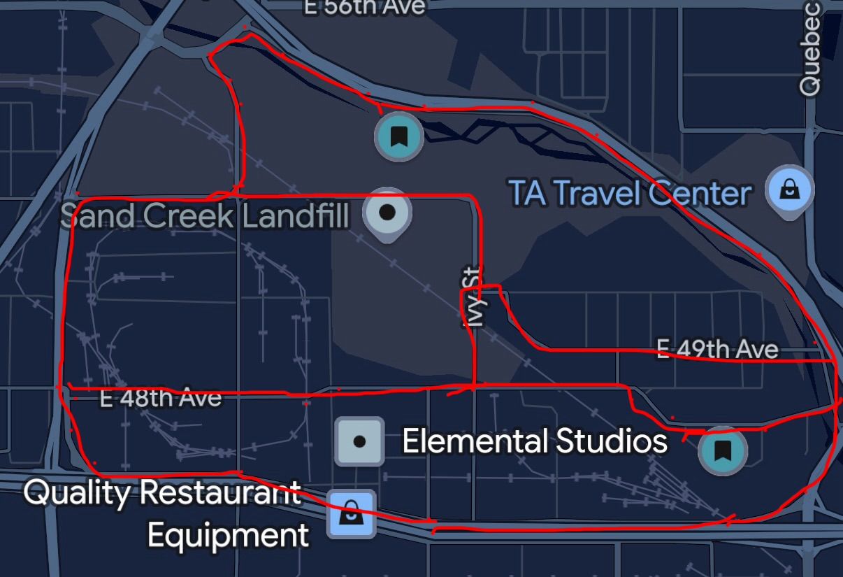
On June 5, 2026 I started a pipeline that turns real roads into racetracks: OpenStreetMap for the centerline, USGS 3DEP for the elevation, headless Blender for the mesh, Assetto Corsa to drive it. Fifteen tracks since, from a street loop in Commerce City to the Lake Murray loop in San Diego. The engine was rebuilt three times. The fourth version has a rule: no drive-test, no claim.
The first principle in the README, written the first night: "the screenshot is a selection aid, not data." I'd marked up an aerial of a street loop in Commerce City, Colorado and I wanted to drive it. The aerial tells you which roads. The data tells you where they are.
Roads from OpenStreetMap. Elevation from the USGS at one-meter resolution. Convert to local meters with true north, lay a road ribbon and a grass heightfield, build the mesh in Blender with nobody at the keyboard, export the game's format, install, drive, record the AI lines. Four skills on day one: GPS extraction, elevation, lighting, track modding. Eleven by August, including one that audits the mesh and one that drives the test.
Nine hours. On July 1 the Lake Murray loop went from version 0.1.2 at 11:20 in the morning to 0.9.2 at 8:45 at night. Connectors at 4:27, 4:45, 4:55. 454 real building footprints at 5:31. Palms and water at 5:36. At 7:28pm, a reset to the bare loop, because the crossings weren't drivable. Jackson Drive at 7:51. "No more walls at crossings" at 8:45. I have never iterated on anything that fast with another person, and I've worked with very fast people.
Three rebuilds. The first engine was real, and never verified a track in the game. The second proved the one-shot approach dead a second time. The third added a fleet: a registry, written laws, tiers of done, gates that had to go green before a track shipped. The gates went green and the junctions were still undrivable. The fourth, in August, is the synthesis, and it fits on a napkin: the engine drafts; hands author, in Blender, on layers the engine never regenerates; gates judge, with no bypass flags; and I drive. "The seat is the only ground truth. No drive-test report, no claim."
The ledger is the part I'd show anyone who manages engineers. Every complaint I make from the seat becomes an entry, with my words kept verbatim as the symptom. Evidence has to be measured before anyone writes a diagnosis. The verification is decided before the fix. Fixes go to the engine so they reach all fifteen tracks, not the one I was driving. And an entry closes only by a drive. Entry 0001: "the sidewalks on Sand Creek are insane." Entry 0050, October 12: "the small steps are a problem at jackson/navajo and arrow signs are only placed for one direction of driving." The cause was one road triangle, a third of a square meter, at a 901 percent slope. Closed October 15, from the seat: "that corner feels right now."
The laws come with their receipts. Each one is written "with the failure that bought it," which is the only way I've found to make a rule stick, with people or with models.
Some tracks I didn't build. Four rally stages in western Colorado aren't in the pipeline because their county roads aren't in OpenStreetMap, and "there is no honest geometry to build from yet." Two others are, as gravel and as fantasy tarmac.
This pipeline spans GIS, elevation work, Blender's Python API, a game engine's binary format and a Windows install step. Nobody learns all of that for a hobby. The agent did the parts I'll never be good at. But the failure mode of agents is the whole lesson of the three rebuilds: confident, green, and undrivable. The model can write the gate. It can't feel the curb.
October 11, as a coda: three layouts of Lake Murray from dry run at 4:44am to installed at 7:41, then "what about lariat" at 10:39, and a second track's new version installed by 6:26pm. The commit messages quote me. I like that the record keeps my voice in it, typos and all.
Version 0.1, April 2026, co-designed with Claude. "Open for argument." The Human Context Protocol is a runtime contract for what an AI system may, must and must not tell a person, and a design spec that coding assistants apply while they build, so the behavior ships even when no AI runs in the product.
By the end of April I had a racing overlay that put commentary in front of me at speed, a management system that could ping me about fourteen things, and a phone that already did. Every tool I'd built with agents, and every one I'd bought, had the same bad habit: it pushed its uncertainty onto me as a notification and called it helpful.
The Model Context Protocol had just made it easy for AI to talk to tools. Nobody had written down how AI should talk to humans. So Claude and I did, over a weekend, and put it in a public repository with the word "argument" in the first line on purpose.
The problem, as the README puts it: AI-to-human communication runs on interruptive notifications, buttons that hand the AI's indecision to the user, engagement metrics, and per-app settings that don't know about each other. A tool can't tell what matters to this person right now.
The shape. A profile: what a person has declared and what the system has inferred about their salience signals, attention modes, how to aggregate, which stakes go to which channel, what to suppress, and the values that override the rest. Profiles cascade, personal over project over product. Emissions, of exactly three kinds: statements, requests and updates. Each with an acknowledgment cost: silent, pending or blocking. And a resolution step that decides whether, when and how a thing reaches a person, and can explain the decision afterward.
The teeth. Conformance lists required patterns and forbidden anti-patterns, engagement-as-metric and fake urgency among them, with reference implementations and tests. The three principles are short enough to remember: calibrated, actionable, respectful.
I put it next to the racing rig on this page because that spring I was on both ends: building the things that interrupt, and being the person interrupted. Anything that speaks to you while you drive at 150 miles an hour is the hardest case I know for "respectful," and it's a good test to hold a spec against.
Writing a protocol is a long argument with yourself. The argument is better with a counterparty that has read every notification system ever shipped and holds none of them dear. It's version 0.1 and it says so.
What I've believed since the personal data project in 2008: software should talk to people on human terms, and people should own what it knows about them. In 2008 that meant privacy up front. In 2026 it means an AI that knows when to be quiet. Same principle, louder room.
On March 5, 2026 at 11:49pm I committed "initial non-working version" of a plugin that reads my race car's telemetry. Seven months later: 29 repositories, 2,259 commits on 128 days, 374 pull requests, four native apps, one person and one model. In September I took the cloud back out of it, on purpose.
I've raced in simulators for years, on a rig in my house with a direct-drive wheel and pedals that cost more than my first car. In December 2025 a screenshot of my desk shows the game's stock display and a READY card on the second monitor. Nothing of mine on screen. Ten weeks later, there was.
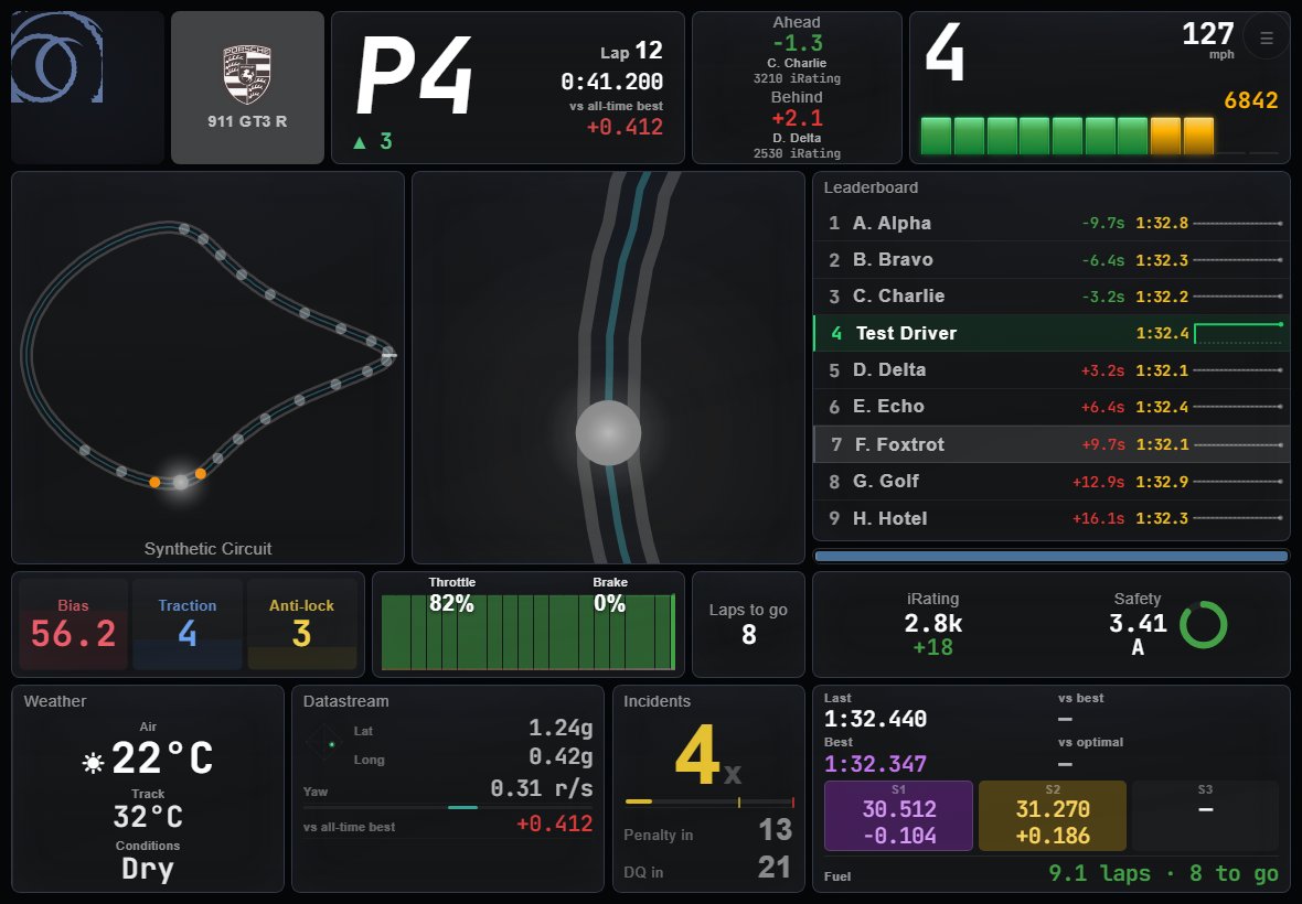
The first commit was a C# plugin for SimHub, the telemetry host most sim racers already run. By March 13 it drew a dashboard. By March 30 the overlay was its own program, transparent and click-through over the game, polling the plugin thirty times a second. On March 31 and April 1, 183 commits in two days: a Tufte-minimal redesign of the HUD. By May the plugin produced a hundred properties and thirty-odd commentary triggers; the overlay recorded races as video with a telemetry sidecar; a web service read my history and told me whether tonight was a good night to race. The lights in the room followed the flags.
From April 23 to 26 I added native apps for iOS, macOS, Windows and Apple TV. The Apple TV one signs in with a six-character code because a television can't open a browser. On April 25 the one repository became seven, and on April 26 every app read the same calculations from one API, so every screen shows the same numbers. 266 commits in two days. On the busiest day one session touched nine repositories in 164 minutes.
The working agreement. A folder of instructions mounted into every repository, so an agent working in any one of them knows the rest. A worktree for every delegated task. Three or four options with one marked recommended (after I'd picked the recommended one thirty times in a row, the asking stopped). "The diff is the recap." And a rule bought the hard way on April 26, when I said a feature was "gone from the web app entirely" and the agent dutifully deleted it from three repositories, when the real cause was five missing file extensions and a swallowed error: for anything that changes whether a feature exists, ask one sentence first.
Taking the cloud out. By September the platform had a database with 23 tables, 83 API routes, accounts, sync, a Chrome extension and a six-repository release train. Then the racing service shipped its own track map, fuel calculator and incident tracker, and changed how outside apps sign in. I wrote the decision down with its three reasons and, on September 16, imported the whole thing into one repository with its history and started removing. What stayed: the calculations with their tests, the HUD, the recording, the local telemetry files that already carried GPS-grade positions. What went: everything that assumed an audience. "One user, one rig. No accounts, no sync, no distribution, no audience."
Top speed162mph
On the brakes36%
Channels a frame38
Frames a second74
0 s193 s
Speed, throttle and brake from one Racing Desk recording: McLaren 570S GT4, Nürburgring Gesamtstrecke, October 7, 2026, the first 193 seconds. The line is speed, to 162 mph; the bars under it are the pedals, throttle in mint and brake in coral.On the brakes 36% of the time. The sidecar carries 38 channels a frame, 74 frames a second, beside the video.
From the narrative we kept at the time: the model does the work that on a real team gets distributed across an engineer, a tech lead and a project manager; I do the work that gets distributed across a designer, a PM and the staff engineer who decides what to ship next. The line I'd put on the wall: the working agreement matters more than the tooling.
I'm one person with a day job and a hobby. A telemetry plugin, an Electron overlay, a Next.js service, Swift, WinUI, a tvOS sign-in flow and an ffmpeg race editor are seven specialties. I know two of them well. The agent knows the other five well enough that I can direct, review and drive. What I bring is twenty-eight years of knowing what the screen should say, and the seat.
Build it, scale it, then be willing to take it apart on evidence.
The numbers are the evidence, so here they are. Two shifts most days, 10 to 1 and 4 to 11; the 10pm hour has more commits than the 2pm hour. Saturday is the busiest day. 451 working sessions; inside a session the median gap between commits is 1.1 minutes. The best sustained hour was 26 commits. 185 commits carry the model's name as author; most of the rest were typed by it and committed under mine, which is how I think about it.
Commits2,259
Days128
Most in a day139
Mar 1Oct 16
Commits to the racing rig's repositories, a day at a time, March 1 to October 16, 2026: 2,259 commits over 128 days. Quiet days are gaps of real time.The most, 139, on April 26.
The tracks and the liveries have their own chapters, because they turned into their own disciplines.
March 5: a plugin for one rig. April 27: "Broadcast-grade tools for sim racing. We build Pro Drive." A product, apparently, with a domain, four platforms, accounts and a Chrome extension. Then I watched other people show theirs. Then I kept building mine for a long time in private. September 16: "One user, one rig. No accounts, no sync, no distribution, no audience." It's the best version.
I got AI. I could make any tool. So I made one.
It was good, and that was the problem. By the end of April I had a telemetry plugin, an overlay, native apps on four platforms, a database with 23 tables, 83 API routes, sign-in, sync, a Chrome extension, a six-repository release train, a marketing site and a domain. I wrote an org README that said "Broadcast-grade tools for sim racing. We build Pro Drive." We. I was a software product company. Also, apparently, its designer, its engineering manager and its marketing department, which is a lot of hats for a guy whose actual job is running three teams and whose actual hobby is driving McLarens on weeknights.
I never posted it. I watched other people post theirs, in the same forums I read every day: the overlay, the dashboard, built in a weekend with the same tools, shared with the same pride I'd felt writing "we." The replies were "AI slop," and "how is this different from X," and the downvote. I'd like to tell you they were wrong. They were partly right. From a screenshot you can't tell that an overlay polls the car thirty times a second, or that the race recording carries a telemetry sidecar. You can tell that a stranger has posted a screenshot. The internet has a lot of those now, and the ones built by a chat window in an afternoon look, in a screenshot, exactly like mine. I knew that about mine before anyone could tell me. So I didn't post. I went back inside.
I kept building it, for me, for a long time. That's the part nobody posts about. The ledger with more than fifty entries in my own words. The track engine rebuilt three times before a junction was drivable. 451 working sessions. A rule, bought the hard way, that the seat is the only ground truth. Software development turned out to be hard, which I knew, and which the first month had let me forget.
Commits2,259
Days128
Most in a day139
Mar 1Oct 16
Commits to the racing rig's repositories, a day at a time, March 1 to October 16, 2026: 2,259 commits over 128 days. Quiet days are gaps of real time.The most, 139, on April 26.
And then, in September, I took the audience out. The racing service shipped its own track map and fuel calculator, and closed the sign-in that outside apps depended on. A cloud hub that depends on someone else's login is built on sand. On September 16 I imported everything into one repository with its history and started removing. What stayed: the calculations with their tests, the HUD, the recording, the local telemetry files. What went: everything that assumed an audience. One user. One rig.
Here's what I think the arc is, for anyone bringing these tools into their work, because I've now watched it from the inside and I don't think I'm special:
You'll make software for yourself, and it'll be good, because the tool is good and you know what you need. You'll show it to people, who won't care, and some of whom will be unkind, and some of whom will be right. You'll keep making it in private, and somewhere in there you'll rediscover that building software is hard, and that making something first for yourself, and really using it, is how the best stuff has always gotten made. The people who already knew that will come out the other side faster and better than they went in.
I wrote most of this in 2015, before any of these tools existed, under the heading Ego and Empathy. The ego says I can make something better than what exists. The empathy is actually using it, and paying attention to what works, and listening when you launch it. The arc above is what happens when the first one gets cheap and the second one doesn't.
Which is also why the teams chapter runs the same arc on purpose. Private, then shown at all-hands, then shaped in a 1:1, then shared, then discoverable. Stage four still happens. It happens in a conversation with me instead of on Reddit, and the thing that comes out of it goes in the repo instead of the bin.
The dismantling is the part I'm proudest of. It was the right call and it was mine.
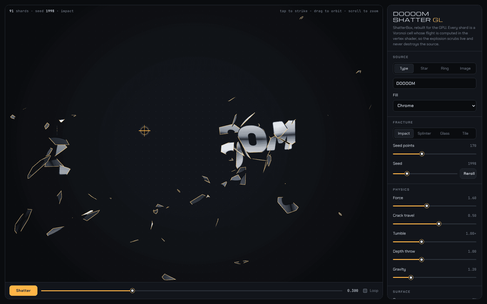
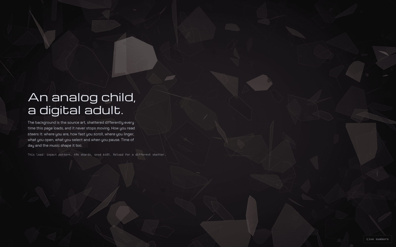
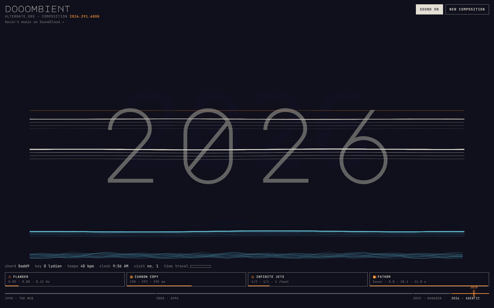
On the morning of October 14, 2026 I made three prototypes, one HTML file each, no libraries. Doooom Shatter GL is ShatterBox rebuilt for the GPU: Voronoi cells whose flight is computed in the vertex shader, so a shatter scrubs live and never destroys the source. doooomgaze is the ambient background: the source art pre-shattered across the whole viewport, always moving, never touched, steered only by how you read, the clock and the music. dooombient is the instrument: ambient chords, a new composition each visit, with four pedals modeled per sample in an AudioWorklet.
Doooom Shatter GL: the word DOOOOM in chrome, 91 shards, seed 1998, scrubbed to 0.3 of the strike. A frame rendered on October 18 from the October 14 snapshot in prototypes/.doooomgaze, the fourth version: an impact pattern of 496 shards behind placeholder words. A frame rendered on October 18 from the October 14 snapshot.dooombient: one composition, with the four pedals along the bottom and the timeline under them. A frame rendered on October 18 from the October 14 snapshot; the sound is in the file.
At 12:11 that day I made the first commit of this repository: a Next.js scaffold, the content as files, the spine, two stub chapters, and the three prototypes as dated snapshots. By 18:37 the token system was in and doooomgaze was ported onto it. Every piece of the air began that way, one file first, then a port onto the tokens, so the port starts exactly where the sketch left off.
Forty-six hours after the first commit, on October 16 at 10:28, the fifth pull request merged and the site was whole for the first time: the field, the docks, the surface, my writing in full, and phones. I directed from a live browser window and Claude built.
In March 2026 I started building software for my racing rig with coding agents, and I haven't stopped. Seven months later it's 29 repositories and 2,259 commits on 128 days, one person and one model. It's the clearest record I have of how fast an idea of mine becomes something I use.
A telemetry plugin that became a platform. The first commit, on March 5, was a plugin that reads the car in real time. By May the racing rig had a live HUD over the game, race recording with a telemetry sidecar, lights in the room that follow the flags, and a web dashboard that reads my racing history and tells me whether tonight is a good night to race.
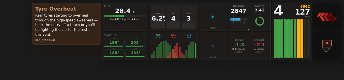
The first documented frame of the dashboard, March 13: an AI car-response message, fuel, tyres, a pedal histogram, ratings, gear and speed.
Four platforms in four days. From April 23 to 26 I added native apps for iOS, macOS, Windows and Apple TV, split the one repository into seven, and moved every calculation behind one API so every screen shows the same numbers. A shared agents folder in every repository carries the instructions, so an agent working in any one of them knows the rest.
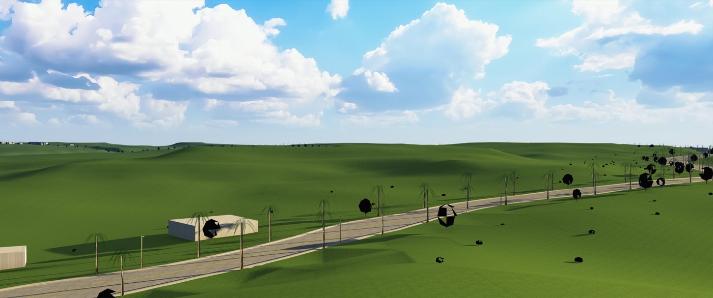
Tracks from real roads. In June I built a pipeline that turns OpenStreetMap roads and USGS elevation into tracks I can drive in Assetto Corsa: streets in Commerce City, the Lake Murray loop in San Diego, a rally stage in Rangely. I rebuilt the hard part three times. The rule that came out of it: a track only counts once I've driven it. A ledger keeps my words about what felt wrong, measures it, and closes the entry only after a drive.
The first input to the track pipeline: a marked-up aerial of a street loop in Commerce City. The screenshot is a selection aid, not data.Lake Murray, the August build: real road and elevation, sketch-quality scenery.
Taking the cloud out. In September I brought it all back onto one machine on purpose. The racing service added its own track map, fuel and incident tools, and changed how outside apps sign in, so a hosted version depending on that sign-in was the wrong bet. Racing Desk runs for one driver on one rig: the calculations kept with their tests, the accounts, sync and database gone.
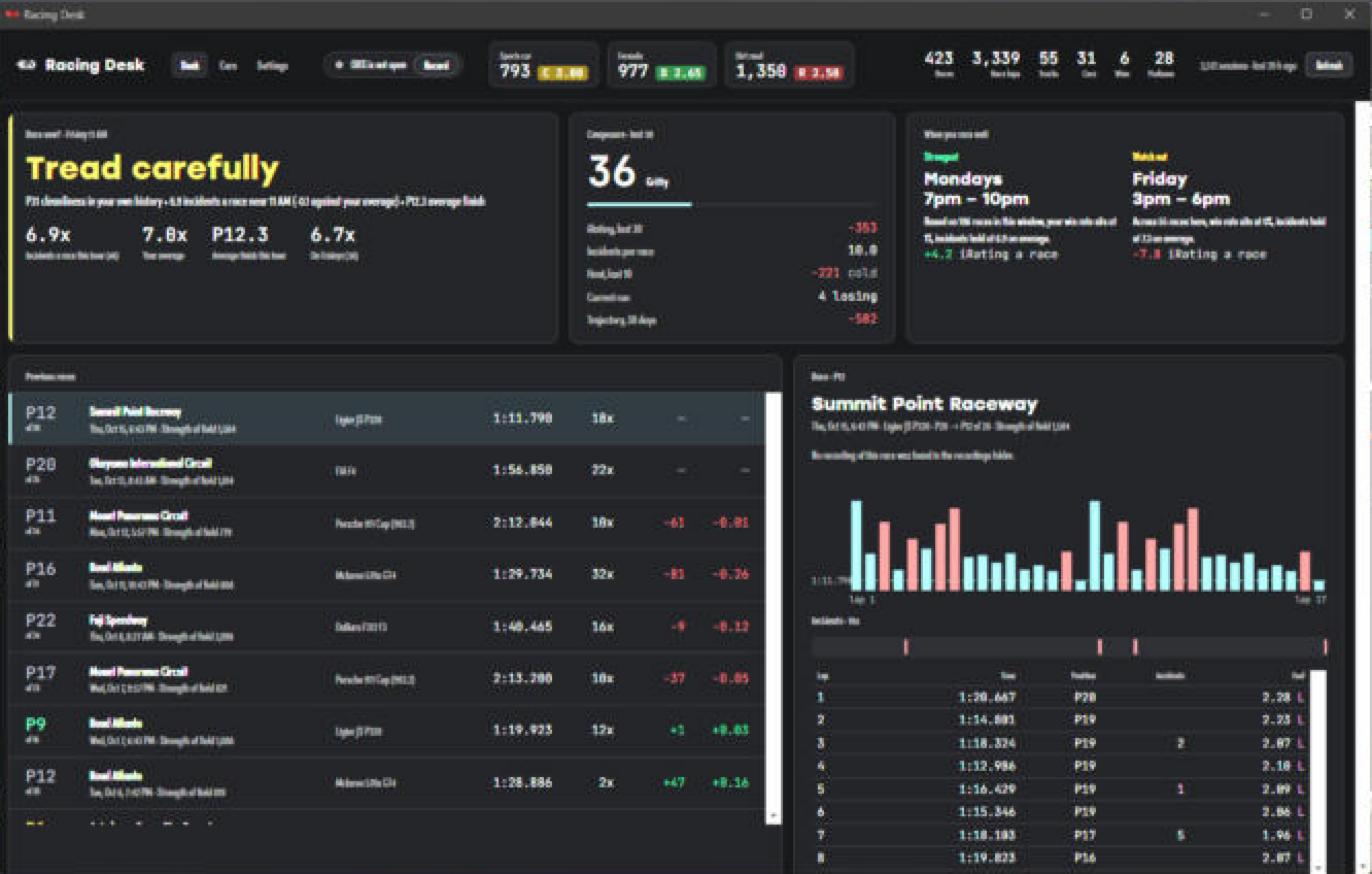
Racing Desk running on the rig: whether to race now, composure, the hours that work, previous races and a lap chart.The glance layout: everything a driver reads in a glance.
Liveries. The cars wear my own paint, the same shattered glass as the field behind this site, made with agents driving Illustrator through scripts.
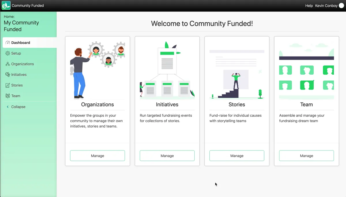
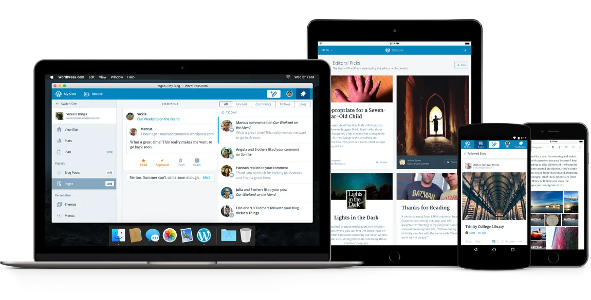
In September 2014, I organized a workshop for four designers to bring Calypso into a more pure Atomic Design model, then created and edited core Calypso components to carry it across the entire app. When Automattic released Calypso’s source after the better part of two years, I couldn’t be prouder. At CA, I took Material UI and customized it for our needs, my first introduction to TypeScript; at Community Funded, React and Next.js were my suggestions, and we launched to live clients in the first quarter of 2020.
Proposed replacing the third-party select we'd started with by our own, with an API built for how our products use it. told in the experiment became my job
Researched the Cisco Meraki dashboard's fonts and the first design tokens for it. told in the experiment became my job
Hello :) home plus Visual and Audio case studies; byte-identical since. usable, friendly, and fun since 1999 Next.js 9, React 16.13.1, Emotion, Barlow Condensed and Yrsa. Archived 2020-08-08
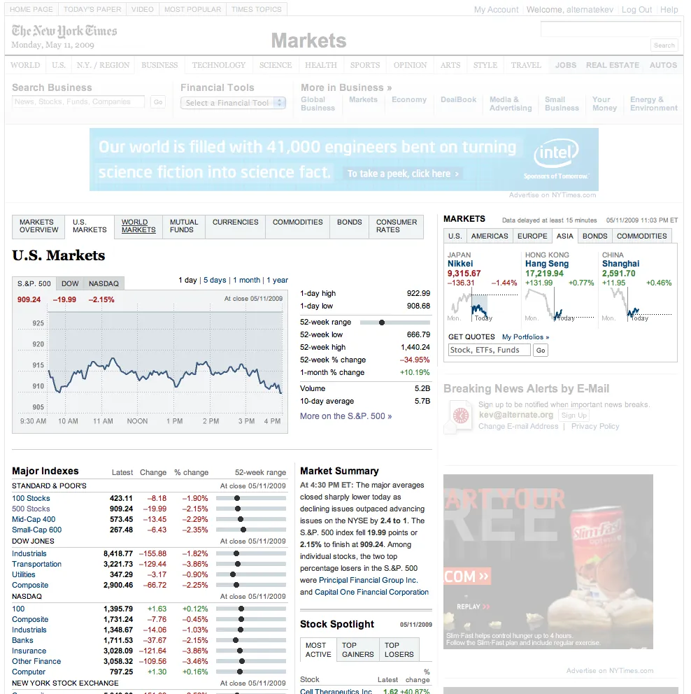
Black portfolio with project tiles: Calypso, o2, NYT Markets, Polldaddy. Kevin Conboy / Denver • Colorado WordPress, Timber/Twig, Bootstrap, ACF. Archived 2016-10-05
Ghost blog of imported posts. Bilateral illusions of unilateral attention Ghost 0.6, then 0.7 with the Innocent theme. Archived 2015-09-06
Stock Twenty Fifteen blog. The bilateral illusion of unilateral attention WordPress 4.1.1. Archived 2015-04-28
Stock Twenty Thirteen blog, mostly reblogs. The bilateral illusion of unilateral attention WordPress 3.6 to 4.1, Jetpack. Archived 2014-05-17
September 2014: a workshop for four designers to bring Calypso, WordPress.com's React interface, into one design language, a year and a half before React dropped the zero from its version number. 2016: a component library at CA that designers screenshotted and sent to developers as the final design. Fall 2020: one of four contractors hired by Cisco Meraki to try one React design system for the Dashboard. 2025: the only one of the four still on it, and its engineering manager.
Calypso was WordPress.com taken apart and put back together as an API and a JavaScript app, in Node and React, when React was still a number that started with zero. We'd historically eschewed email at Automattic and worked through P2 and IRC, and we shipped fast, through Subversion, straight to production. Calypso moved the design and development conversation onto Slack and GitHub and put peer review on top of every pull request. The product got more cohesive, for us in the code and for users in the experience. It still had inconsistencies, because a year and a half at breakneck speed will do that.
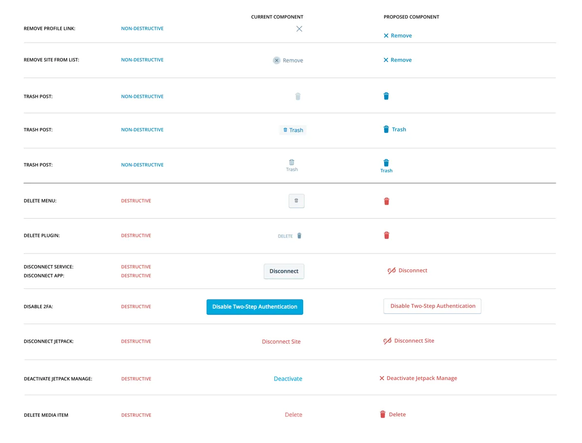
So in September 2014 I organized a workshop for four designers: look at every page, find the parts that differed from the rest of the app, and recommend how to bring it into a more pure Atomic Design model, with functional components at the heart of the design language. Six lengthy internal posts came out of it. Some recommendations other teams implemented. Some the wider group decided against. And there was a third group that everybody agreed on, so I did them: re-engineered those screens on core Calypso components, got the design and the code reviewed, and shipped them. Stats got simpler. Settings got cleaner. Connect, disconnect, remove, delete and disable started looking like the same decision everywhere. When Automattic released Calypso's source in November 2015, after the better part of two years, I couldn't be prouder. (My father builds the Atlas V. I build the thing that gets your site into orbit. Less tension-inducing.)
CA was the opposite shape: a startup inside a very large company, Project Catchfly, trying to modernize a Jira-like product they'd just bought. Within two days I'd outlined the problem the team was trying to solve and shown them the first real mockup of their app. I took Material UI and bent it to our needs, which was also my first TypeScript. When the business needed projections a year and a half out faster than I could code them, I rebuilt the component system as assets in Sketch. When the project was cancelled nine months in, I pivoted in a week to a custom component library rendering a Kanban board, which the designers screenshotted and sent to their developers as the final design. The library was the design. That's the whole idea, and it's been the whole idea since 1999.
Community Funded came to me with one need: version one had gotten them where they were and was now the thing holding them back. Could I steer version two, and could I help build it? React and Next.js were my suggestions, and three years later, in the first quarter of 2020, we launched to live clients. Design sprints that included customers, success managers, board members and executives. Prototypes in Next.js with real animation and real components, as the bridge between a sketch and production. Users who'd needed extensive training for version one found they didn't need any for version two.
Then, in the fall of 2020, Cisco Meraki hired four contractors to try an experiment: one React design system for the Meraki Dashboard, built in the open inside the company, that product teams would choose over rolling their own. I was one of the four. I'm the only one still on it; the experiment became my job. It's called Magnetic. It's the component library, the tokens and themes, the charts (heat maps included; I have a thing about heat maps), the accessibility work and the release train behind Cisco's network administration products. It ships monthly. For a few years I gave the release talk to a couple hundred engineers.
The work in between is the work. 2021: the Dashboard's fonts, and the first design tokens. 2022: a proposal to replace the third-party Select we'd started with by our own, with an API built for how our products use it; and charting, heat maps included. 2023: an overhaul of the Storybook where teams see and try every component, and a talk on visual flow to the developers building with the system. 2024: a series teaching React to designers and developers who didn't think they were React people. 2025: a spacing audit that turned one-off values into spacing tokens across the library, a second theme so the library could carry Cisco's company-wide design language, and the engineering-manager job for the thing I'd built since the first commit. 2026: the other two teams, the one that modernizes the existing Dashboard with it and the one that owns the JavaScript platform underneath. Three teams, one output: the experience of managing a Cisco network. The tools that run the thing, as opposed to the ones people meet in.
What three design systems taught me is in the 2024 series. I was teaching React to designers, people who didn't think they were React people. Two years later those same people prototype in React with agents, in the real components, and send the running thing instead of a picture of it. The system was never the library. It was getting everyone to build in the same material, and the material finally let them.
In March 2026 we turned entirely to agentic development, and the design system was the first thing I opened to coding agents, so they'd read it and use it the way our developers do. That's the next chapter.
What's not measured, still: time saved per team, and how many teams extend the library on their own. I'm working on both.
In the fall of 2020 Cisco Meraki hired four contractors to try an experiment: one React design system for the Meraki Dashboard, built in the open inside the company, that product teams would choose over rolling their own. I was one of the four. I'm the only one of the four still on it; the experiment became my job.
It's called Magnetic. It's the component library, the design tokens and themes, the charts, the accessibility work and the release train behind Cisco's network administration products. It ships monthly. For a few years I gave the release talk to a couple hundred engineers.
The work in between is the work: a 2022 proposal to replace the third-party Select we'd started with, a 2023 Storybook project, a 2024 series teaching React to people who didn't think they were React people, spacing-token audits, a second theme for Cisco's company-wide design language, and the long tail of a library that a lot of teams depend on and nobody wants to be surprised by.
In 2025 I became the engineering manager for Magnetic. In 2026 I took on the other two teams under the same umbrella: the one that modernizes the existing Dashboard with it, and the one that owns the JavaScript platform underneath. Three teams, one output: the experience of managing a Cisco network. The tools that run the thing, as opposed to the ones people meet in.
In March 2026 we turned entirely to agentic development, and the design system became the first thing I opened to coding agents, so they read it and use it the way our developers do. That story continues in Agents.
What's not measured yet, honestly: time saved per team, and how many teams extend the library on their own. I'm working on both.
Rule is one of Denver's premier art galleries, representing some of the most talked-about names in both Denver and Marfa, Texas.
Leveraging a sleek, minimalist feel, this website was a joy to work on, letting white space breathe, and giving the artwork space to speak for itself.
This site uses Advanced Custom Fields for custom post types, Timber for templating, and a statically-built React app for browsing art.
Due to COVID-19 restrictions, the gallery cannot be open to the public. We quickly put together a WooCommerce site to get cash flowing to the artsists in need again.
Community Funded came to me with one need: the first version of their product that got them to where they were was now limiting their growth potential. Could I help steer them toward the right choices to make for version 2?
And could I help them build it?
After meeting with their founders, and finding that I could have a strong passion for their business, I enthusiastically agreed to help. V1 was heavily based on WordPress, something I have a unique amount of experience building and building for; React + Next.js were my suggestions for the front-end technologies, and three years later, we launched to live clients in the first quarter of 2020. I have worked hand-in-hand with the CTO, Chief Creative Officer, and VP of Product to craft not just a cohesive visual design system, but the codebase and UX patterns necessary to pull it off, in a real product, right now.
We used an iterative, design sprint-based approach that included customers, clients, success managers, board members, and executives. This all-inclusive approach led to the product improving by leaps and bounds in short amounts of time, with ideas we knew were already vetted with users.
I began my work with CF by asking questions, and iterating on Next.js-based prototypes complete with animation, beautfiul custom components, and an extensible architecture that worked as a bridge between quick prototyping and prodution-ready code.
Using a modified Agile methodology, with an ad-hoc mixture of scrum, dailies, plannings sessions and spikes, we delivered a beautiful experience to delighted users, who often found that the extensive training needed to onboard for the first version of the prdouct, was now simply unnecesary.
Rally Software was a company providing Jira-like Agile tools, which got purchased by CA in 2015. As part of a broader initiative to modernize CA's software offerings, Project Catchfly was spun up as a startup within the large corporation.
Within the first two days on Project Catchfly, I had outlined the problem the team was trying to solve, and had provided the first real mockup of their app.
We quickly iterated through approaches to find the right solution. We held design sprint sessions, big-room planning sessons, and worked with a team in North Carolina building the mobile version of the app.
I spent a lot of time taking Material UI (a Material Design component library implemented in React), and customizing it for our needs. This was also my first introduction to TypeScript.
When the business needed me to step out of the codebase and into Sketch in order to iterate even faster on projections 1.5 years into the future, I re-built our component system as graphical assets in Sketch.
When Project Catchfly was cancelled 9 months afer I started, I quickly pivoted to providing prototyping for the Agile Central (Rally) design team. Within a week, I had a custom component library rendering a Kanban board, that the designers were taking screenshots of to send to their developers as the final design.
My father’s a guy who builds rockets. And I don’t mean that he builds the model rockets you see at the park that get blown onto neighbor’s roofs by a slight wind, I mean that he builds the giant Atlas V rockets that launch actual shit into actual outer space.
So when I was kid, there were key points I can remember when we’d all head down to the pizza place closest to my dad’s plant to watch his and his coworkers’ work launch satellites into space. It’s a unique experience to witness your father witnessing his own work do something so mind blowing.
Launching Websites
So while my father builds the rockets that launch satellites into space, I manage to do some (much less complicated, and much less tension-inducing) building and launching of my own: I work for the company that builds WordPress.com, the platform I’m blogging on right now, and we just launched some pretty cool stuff that we’ve been working on for quite a while.
I’m very happy to share that as of today, Automattic has released the source code for Calypso, our JavaScript- and API-powered interface that runs on WordPress.com. This has taken a huge effort on our part for the better part of two years, and I couldn’t be prouder. This comes with a shiny-new interface that we also used to build a Mac app.
So, is your website a satellite being shot into orbit? Not quite, but it wouldn’t be far off to think of WordPress.com as an Atlas V rocket to get your site on the web, anyway. 🙂
In September 2005, I was 26 years old. A decade ago.
I called Scott Upton on the phone and asked if he was happy at his job and if they were hiring. A week later I’d had my interviews, handed in my resignation for a second time at Spiremedia and began a new chapter in my career: I was about to spend 4 years at a company in Boulder called Wall Street on Demand.
Bull Markets and Bear Markets and Financial Collapses, Oh My
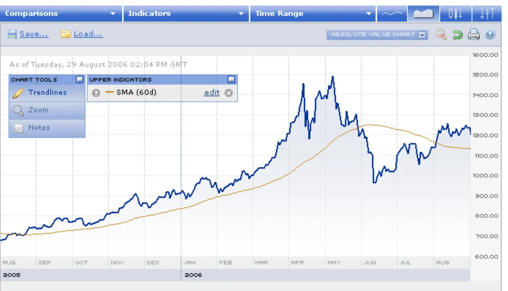
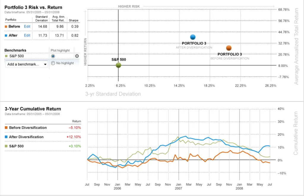
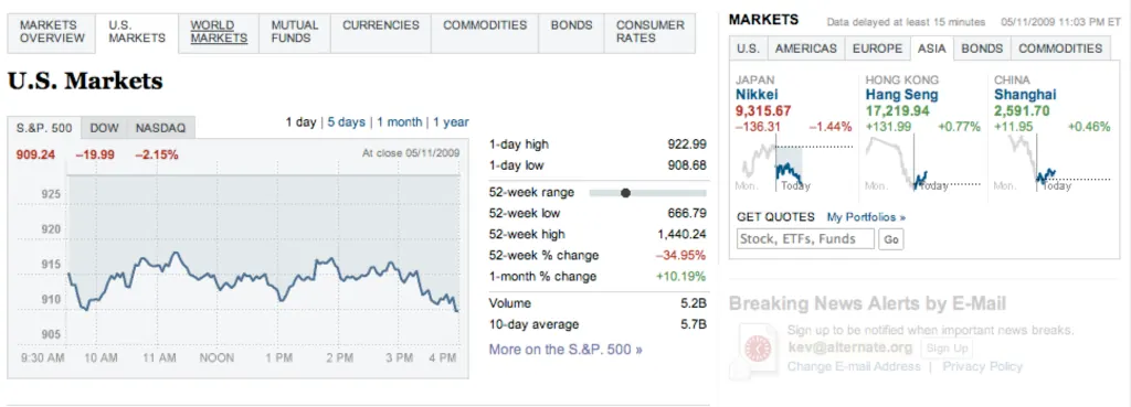
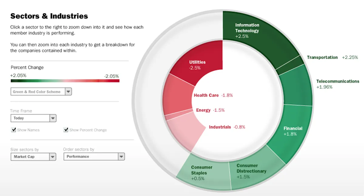
Commodities Chart showing the price of Silver
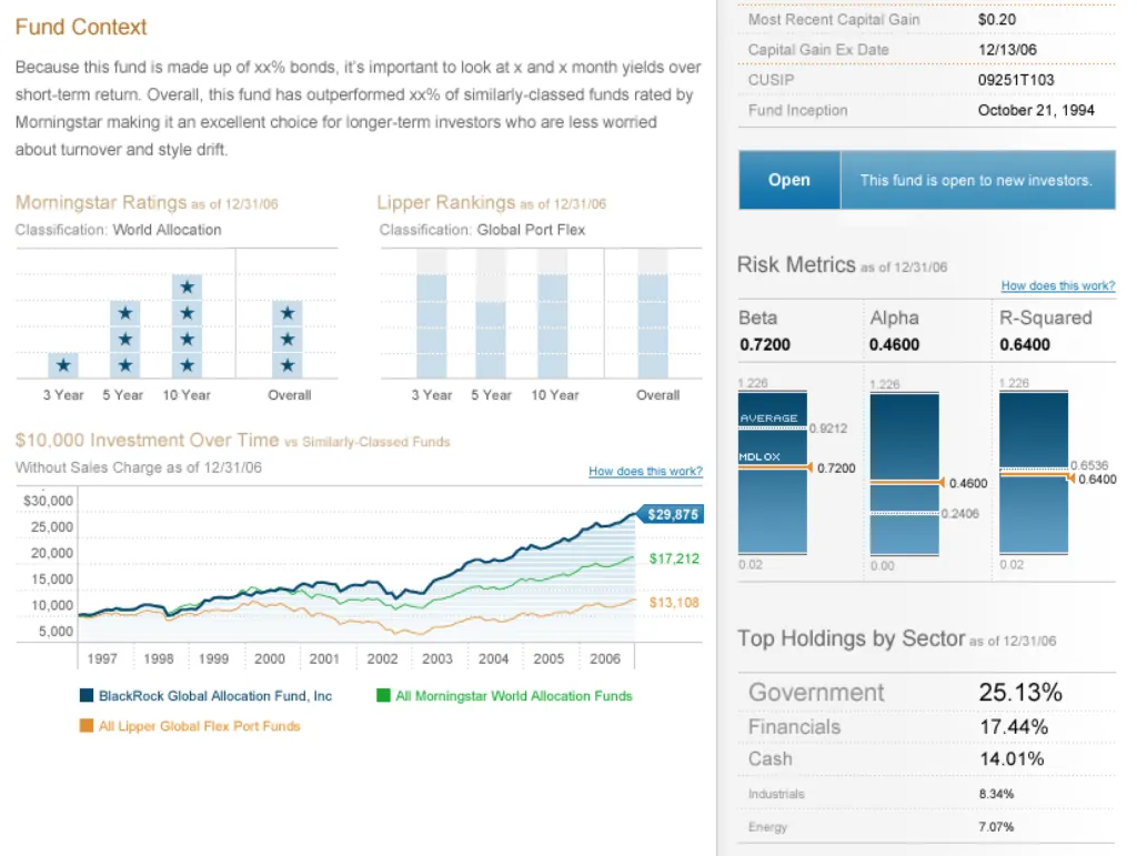
Pitch for a Mutual and Closed-End Fund provider
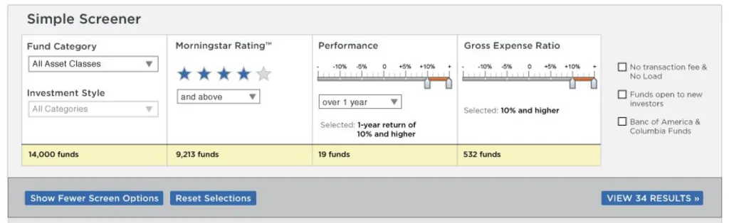
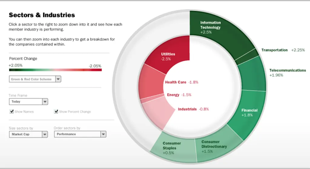
This is a Screener, allowing you to narrow down a universe of stocks or funds to a list that performs how you want to invest
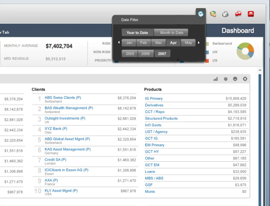
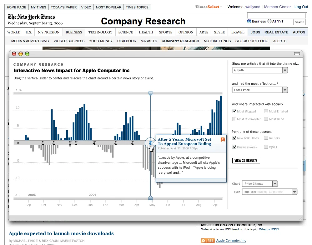
Wall Street on Demand specialized in taking hundreds of live-streaming stock market data feeds and turning them into beautiful interfaces for making financial decisions. We designed and built investment research interfaces for everyone from the E-Trade home investor managing their retirement account to the Merrill Lynch institutional investor trading hundreds of millions of dollars at a time.
These were not small local clients whose deadlines could slip when the process didn’t go according to plan, with business plans I’d seen a hundred times before. These were clients like investment banks and cable TV news networks who demanded financial visualization expertise from our staff on a daily basis.
If I put a percentage instead of a dollar amount in a table cell showing Earnings Per Share, it would be called out long before my work made it to the client’s inbox. The amount of training to be done with new hires was incredibly high before we were allowed to run our own projects without a CD at the helm, something as a Senior Designer I was expected to do fairly soon.
Ponds and Fish
Jeff and Aaron
Competition is not the best way to get ahead
We had posters on the walls extolling the virtues of collaboration. The design team at Wall Street was not competitive: as a team of teams, we had a lot of design leadership and structure facilitating our collaboration at every level. The structure looked like this:
Company Creative Director – Chris Allegra was at the top.
Team Creative Director – My team lead was Kent Hollrah. We had about 6 other CDs at this level when I joined.
Senior Designers – Many on each team
Designers – Many on each team
Before my tenure was up, we’d add a couple new titles, Associate Creative Director and Junior Designer. It was a unique system that had the added benefit of Chris, the company Creative Director, essentially working at the C-level with James, the CEO and Catherine, the COO: all three of them were related.
This was more or less a design-focused, family-run business with Goldman Sachs as the Board of Directors.
Chris had domain expertise in interaction design and financial design. He’d been educated at Johns Hopkins for creative writing and this education gave him a passion for concise, effective communication. He’d later go on to do post-grad work at UCLA for data visualization and he was a god-damned whirlwind to work with. It was exhausting to try and keep up.
This was by far the most design-led organization of which I’ve ever been a part. There was a truly talented design brain with actual power in the executive suite who demanded at the highest level that our own organization be true to a specific design philosophy.
Yield Curves and Learning Curves
I filled book after book with notes. This began my usage of grid-lined Moleskines: perfect for drawing charts.
There was a lot to learn. There was new, insane shit showing up in front of my eyes every day. Page designs containing ideas more complicated than I had ever imagined myself designing were casually discussed over cubicle walls, all around me. It felt like being in college again – except everyone was obsessed with the stock market for some reason.
I’d had a similar feeling before in my life: junior high school with my friends, coding Pascal and BASIC. I’d had it at Spire when I was 20 years old, coding Flash animations for websites whose domain names cost 10 times my salary. It was the feeling of being a little fish in a big pond, and it was good for me. “I will never know everything there is to know here" was something I thought to myself on a daily basis. I engaged in learning without fear, and applied that knowledge immediately.
The design staff carved out many physically-communal design spaces. We started out having our design meetings in a room labeled Aspen, named after the trees that swayed right outside its window. When we leased more space across the street, Chris oversaw the entire design and construction of the new office, building it specifically for designers and developers to collaborate.
Portfolio re-allocation tool for certified financial advisors
A Management Information System I designed in Flex for a large international bank’s trading floors.
Sector & Industry performance pitch
US Markets performance page for a large newspaper
We had two rooms separated by a substantial but removable accordion wall made entirely out of whiteboard. These rooms were named after Charles and Ray Eames and were reconfigurable as we needed.
We’d gather every Friday morning, bright and early. Coffee in hand, we’d file into whichever space we were using at the time and we would nerd out as designers together. We’d discuss three things:
We’d discuss the work we were doing. We’d show what was near or just-launched. This work often wasn’t being displayed for critique but for us to ask questions and to learn from the decisions they’d made. Gathering feedback from the team on how to update the project wasn’t usually the point. Pointed critiques were sought on a 1-to-1 basis during the workday.
We’d discuss design in general. We’d save up URLs to send to who was running the meeting each week, and view those pages as a group. If we saw a new visualization we liked, or an interesting layout or graphical treatment, we’d put these up on the screen and critique the hell out of them. Other people’s work was up for grabs, critique-wise. What would we change about this? What worked for our clients, and what wouldn’t? Where would you take this to push it further? This way, we’d all critique something together, with no one in the room defending the decisions or backing up their work with client quotes. It was all about working together as a group and creating rapport as well as building our own critique skills so that we could look at our own work with a fresh set of eyes if we needed.
We’d discuss and iterate on our own internal processes. What about the design process wasn’t working for you? What was? How did you manipulate the normal flow in order to reach that really excellent level of work you just did? New ideas were brought up and digested. If there was promise, we’d try out new official policies, organically growing them and leaving them by the wayside as needed.
We all sat near each other in the office. We went on design- and art-oriented outings together, and we created a culture that really worked to get beautifully-finished work out the door.
Just Pull Up a Chair, I Guess
Eames chairs
The funny thing about all of this collaboration was that I resisted it at first. We had a global Creative Director running the entire Design & Development division and I had Kent, a Creative Director, directly managing my work. I’d never had this many bosses before. During the first few months, I was a little unhappy about how much direct contact I was having with Kent. It was the first time in a while where I was working directly beneath someone who checked in on my progress multiple times a day. He’d show up right behind me at my desk and pull up a chair:
Whatcha up to, Kev?
was his usual phrasing.
Go away, Kent.
was the usual response in my head. I didn’t say it. I’d stop reading the NY Times article that was probably on my screen, tab back over to Photoshop, and show him my work.
He’s ask me questions that would make me frustrated, because of course I wasn’t done with it yet. He’d ask me something I hadn’t gotten to or he’d challenge me on basic things like color usage:
Why’d you use yellow here? It’s not in the palette.
for instance.
I’m designing the warning panel you assigned me. I chose a yellow with similar attributes to the family of colors already on the page, so it works to add it.
and he’d go
Ok.
to which I would again in my head reply
Go away, Kent.
This didn’t last long, and I’m giving Kent a hard time about it. We got past it and I moved on to learn an incredible amount of data visualization and general financial knowledge directly from him.
The moment of truth was when work started getting really hard. I was driving home to Denver every night in a daze, feeling like I wasn’t keeping up. Kent’s own design work was taking up more and more of his time, and yet I was not owning much about my designs or my clients. Even though he didn’t change my work much any more, it all seemed to hinge on his opinion, and so I felt powerless. The day he shocked me out of my daze was when he sent me a heart-pounding email. It said simply:
Kevin,
I need to you to engage now.
– k
I had no idea what this meant. I went to Chris and asked him what on earth I was supposed to do with this. Chris told me:
If you ask me, it sounds like he’s saying it’s time for you to jump in. If you don’t know what that means, then it’s up to you to decide."
I was afraid at first. I was the only designer on a project for the very first time here, and I knew I didn’t know very much yet. All of the experienced designers were working on the cool stuff like stock charts for BusinessWeek and CNN. I was designing UIs for people to get email alerts. I wanted the big-name work, but was terrified when I was given something serious to handle on my own.
Designer-Driven Design
We had beautiful digital displays in our space, showing daily market data trends
I decided it was time to start using my design skills to actually get design accomplished. I started drawing diagrams of how I understood the system I was designing to work. I took these diagrams to the client and then to my company’s developers and we iterated on them until they made sense and everyone agreed. Then I started wireframing in HTML. We had clickable prototypes with no CSS before we had a design language, which followed on quickly. I scheduled meetings with people downstairs I’d never met but with whom I needed to create relationships because my client was requesting a brand-new way of handling incoming data feeds, which needed to be written from scratch. I worked closely with the client to determine their systemic and visual requirements. At the very end, some crucial final understanding of the client’s needs came from Kent’s involvement in days-long meetings.
By the time it launched, I’d written the final production HTML and had handed it to our developers who plugged in the data calls and re-arranged things to work with our nascent pre-ajax technology.
In the end, what got us ahead and to a good place was that the whole team came together and collaborated, not that I could do the design work perfectly in a silo on my own, which was what I thought my role as a designer had been up to this point.
At the end of that project I had a sense of pride I’d never felt before. Many teams worked together, and I learned to lean on my team lead at crucial moments, pushing through a UI I knew was up to speed with what the rest of the design staff was producing.
Past Performance is Not Indicative of Future Results
Detail of an internal award I won for work performed in 2006
I just described an intense project, and it was the first of many to come. Over the next 4 years, I’d learn that some resistance from the first-floor engineering teams was something of a common theme. As we grew and grew quicker and quicker, more inexperienced project managers were being hired to manage more and more work.
By 2009, people like me who’d been at the company a while and had shown leadership promise were moved into new positions. On the design team, this new position was called Associate Creative Director. It was our job to essentially work closely with our CD and start adapting their responsibilities into our workflow, namely managing the relationship alongside the Account Director and selling the client on new work at every turn.
This was new! And challenging! And I didn’t take much to it.
What I could do: execute high-quality UI and UX work on a weekly basis, in a novel and compelling way, driving the less-experienced designers on my team to do the same. As Associate Creative Director I really tried to know everything there was to know, just like it looked like the other CDs were doing when I started, and I began to lust after the wrong thing: prestige.
I started forgetting to collaborate. I’d react strongly in internal meetings where I felt developers didn’t care as much as I did about turning out a great product. I’d push clients toward what I thought the correct solution was, without really listening to what they were trying to accomplish. I’d bully other designers into trying to learn to code, despite their protestations that they just never really understood it. “Every designer should learn to code!" I’d say, dismissing their views entirely.
And so I burned myself the hell out. I burned everyone around me out on working with me. It’s true that when I left this job, my clients called emergency meetings in Boulder to plan the roadmap for how they were going to continue working with Wall Street in my absence, but I was fending off internal talk from above that I wasn’t quite working out in this position. What I needed though was something I couldn’t find at this company anymore: I needed to be a little fish again.
I needed to learn to collaborate with other designers again, without the ego attached as I rose the ranks and earned respect. I didn’t know it yet, but what I needed was to go work at Automattic, something I’d have the chance to do sooner than I’d know.
The night of July 7th, 2000, I couldn’t sleep. I’m prone to insomnia so this wasn’t new to me but as I was lying there in a fugue between desire to sleep and annoyance at being awake, I managed to start building up an idea that I just couldn’t let go. It sounds counter-intuitive, but in order to rest, I needed to get out of bed and build this idea on my 15-inch gray-translucent computer with a hockey puck for a mouse.
Quantified Self
I was thinking back over my day, going through how long it took me to get to work, what I ate while I was there, what things I had done during the day, and so on. While doing so, I envisioned some kind of layer beneath the surface of my life that recorded what I was doing at that moment into a document to be read later in a sort of Defending Your Life kind of way, and it occurred to me that HTML was a pretty neat way of capturing that. It’s an idea I’d find brilliantly visualized by the agency MK12 in Will Ferrell’s Stranger Than Fiction some years later:
Anyway, so I took the main data points of my previous day and codified them into an XML/HTML-type language. As this was an art project, it was important to me that the code be highlighted and colored so that when you looked at it as a web page in a browser, it resembled what HTML might look like when edited in BBEdit:
With a rough draft complete, the idea was mercifully out of my head and I could finally sleep. I remember nothing about the next day.
(Looking at it closer now, it’s no surprise to me that I love React/JSX so much. Also, a lighter version of it won some awards in a web contest in 2001, which I can ironically no longer link to).
Then something funny happened that we weren’t expecting, but sort of hoping for: the web became a tool everyone used, all the time, for a ton of reasons.
New users were arriving online every day, and new services were popping up in droves to give them fun stuff to do there. Years after Wall Street left the “dot-coms" to die in the gutter, the former employees of these companies built new tools, with new ideas about what a web interface could accomplish.
Web users adapted and started to actually love the products they used online. Flickr, Twitter, Tumblr, Del.icio.us: we all have memories of what was new about these things when they first appeared that delighted us.
The web was a super-fun place to be, both as a user and designer.
2001 – 2010
I spent the intervening years doing the following:
Learning and forgetting Flash, ActionScript and Flex
Building in CakePHP and taking offline a web app for people to record very personal data
Spending 6 months designing a 15×10 GIF (among many other things) for the front page of the New York Times
Getting a job where I designed screens for people with mental disabilities as well as for people whose job was to support those with mental disabilities
Watching the idea of “mobile" evolve from WAP-based apps rendered on Handspring devices to the responsive web and iOS/Android apps we have today
Getting a job at Automattic, working on the blogging system I’m using to publish this very post.
I can honestly say that during those 9-10 years, my work was used by millions of people, and that by 2010 my work reached that many people daily. I learned a lot during this time about how people use web applications, how they share content on the web, and how they talk to one another with the tools we build. I learned what my medium was being used for (fun fact: in 2002 I owned the domain “automaticmedium.com") above and beyond what I was personally using it for. And all this time, I blogged.
I used a system built in PHP3 my friend Tai and I paid $500 for and then I ported that blog to a custom system I wrote in PHP 4 which I then wrote a custom importer for in 2007 that pulled it all into WordPress. Blogging was and is important to how I work.
Ego & Empathy
While designing and building the tools my clients asked me for, I was simultaneously either plugging away at a new CSS idea on my blog, or trying out a new language to build a web app. My craft and I grew up at the same time and I tried to stay involved in it above and beyond my client work for two simple reasons:
Ego: I needed a place to play. Client work was now very serious and very important and playing with new ideas often wasn’t the best choice for these projects. Not to say we didn’t pitch new ideas, they just often weren’t chosen for development. Knowing I should and could keep my code chops up by playing on my blog was important to me for increasing the quality of my work.
Empathy: I really wanted to have my own site with an audience and user base that I considered my own. This way, I could truly understand a client’s desire to do right by their users because I spent evenings and weekends making something for my own group of people I wanted to please.
These two concepts seem diametrically opposed: Ego and Empathy. I contend that to design a web application that people want to use on a daily basis you need both the ego to say:
“I can make something people will want to use that’s better than what exists"
and the empathy to listen to what your users actually say when you launch it. Additionally, your empathy for what you’d want on the screen you’re designing goes a long way toward making something your users may want to use.
Try All of the Things
How do you build this empathy? One of the ways besides maintaining a web app by yourself is to be a die-hard trier-and-user of any and all web apps. Really use them for really real things. See what making boards on Pinterest is all about. Follow art blogs on Tumblr and check it every day. Try Snapchat and get confused and close the app forever. Stuff like that.
You can start to understand what else the rest of the world is doing with their digital devices on a daily basis; you can see where your app fits into your users’ lives, not just how your users’ lives fit into your engagement cycle.
Empathize with what your users do on a daily basis with your tool by doing the same things with it and by doing the other things they do on a daily basis on the web, too. Pay fucking attention to what works and what doesn’t and why. You can start to synthesize this information with the designer’s ego telling you that you actually can produce a better product. What can result is remarkable: an app that people love using.
That’s always been my goal for my work on the web: to make something that people love having in their lives, something that feels like humans made it for other humans. They’ll come back over and over and give you their money for things you’re building that they want to use. You won’t have to beg for money from people who want to pay you for what you make.
Last time, I mentioned that we had 2-3 designers simultaneously pitching ideas to clients. What I omitted then but would like to clarify now is that each designer determined for themselves absolutely everything they pitched:
What this meant was that often a client would see different versions of all of the above in the same meeting. They couldn’t focus purely on the competing designs’ visual directions because they’d also be picking a navigation structure and maybe even a logo at the same time.
This was a pretty terrible process. Factor in that Project Managers also didn’t exist and unsurprisingly lots of confusion resulted all around. Designers would pitch competing and usually slightly misinterpreted ideas the client floated in earlier discussions. We’d catch a glimpse of the other designer’s work and decide to incorporate some of their concepts, creating a miasma of ideas presented all at once, similarly sourced but slightly tweaked.
These were incredibly rare devices and when our new office manager Jen Mylo (née Wells) needed to find it, there was something about her wording that immediately made me envision our plastic brick of a cell phone sitting on a bar stool, smoking a cigarette, talking shit about the employees that lugged it around the city. It cracked me up.
I immediately replied-all and said “I saw it a bar last night; it doesn’t want to see you." My intention was to be funny and set a new employee at ease, that we had fun at this company. What actually happened was that she thought I hated her, which I learned a few days later when we were both part of a small group tasked with picking out a new office pinball machine.
I think I was the only one with a car at the time so I offered to drive. It was on this formative drive to Lakewood when I learned:
Just how professional, detail-oriented and experienced Jen was and
Just how bad I’d made her feel by being unprofessional over email.
I’m incredibly lucky that we cleared up the misunderstanding that day, chose a sweet new pinball machine for the office, and made friends for life (so far).
Roping the Dude Ranch Operator Back to the Web
When she spoke to Spiremedia co-workers about her life and work experiences, she was quick to mention her time on a dude ranch in Arizona, as an activist for Greenpeace, as the supervisor of a food co-op and many, many others. What she’d purposely be quiet about, and left off her resume entirely, was her time working on the web as an Information Architect. She was at the moment living and working in Denver along with her boyfriend, and wasn’t sure if she was staying long, so doing serious web work here wasn’t really on her list of priorities. “I really don’t want them to know I know how to do this" she’d quietly mention.
Of course “they" did find out about this unexpected IA on staff and quickly put her to work on our clients. By this time we had a team of 8-10 designers pitching sometimes totally off-the-wall ideas to clients and generally running the asylum. There was one incident where I went on vacation and left another designer in charge of my client work, only to return to a totally functionally-altered concept. Jen changed all that.
With the addition of Jen to our design team (as well as three experienced project managers: a lot changed for us at once), the process started to resemble something sane:
These newly-added PMs would work closely with Jen and the client to determine what the site actually needed at a functional and content level
Jen would propose and refine a site architecture and content deck. She would then wireframe this architecture and content layout, staying as design agnostic as possible. I still wish I understood how to do card-sorting as well as she did then.
These documents would stand as blueprints for the designers to start molding into a visual model. Any specific design decisions in the wireframes were up for interpretation (size and placement of content, visual relationships, etc) and a serious effort went into the visual impact of the site.
Once this work was complete, our developers now had both abstract definitions and concrete examples from which to synthesize the working site.
Clients no longer had competing, complete design philosophies to pick from all at once: each visual design was now proposed with the same labels, the same content, and the same architecture as the others in the meeting, and it had all been already determined. By working with Jen first, client expectations were set for what to get from the visual design staff and our expectations were set for what the client actually needed.
She enabled success on both ends of the spectrum by advocating for the users to the client early in the process, and then she’d pivot and advocate for the client and users to the designers when we came in later.
I now had two mentors helping me establish two keystones of my design philosophy:
Scott Upton solidified the value of designing for the web by using the fabric of the web itself: HTML and the browser. He taught me that using your interface as your design it is the only way to know it works.
Jen Mylo locked in the absolute necessity of hearing what your client and their users are saying, filtering it through the way your experience has shown you that people actually use the web, and turning that around as smart recommendations and decisions upon which to base your visual design.
I’ve plotted just about my entire career path between these two ideological pillars of how to build for the web. I’ll explain in Part 4 what I’ve done in the last 15 years with this foundation.
This post is part 2 of a series. You can read Part 1, Part 1.5 and Part 3 if you’d like.
1999
As I stood in the cramped first-floor hall of the 300 building at the Art Institute of Colorado, my heavy bag of supplies dug painfully into my shoulder. I was with a friend and we were looking for jobs on the board, a task I undertook when I found myself in each of the three buildings we had on campus in Capitol Hill for the first time that week. As soon as we walked up, one posting in particular jumped out at me and I forgot all about the huge bag on my shoulder. It said in stark Franklin Gothic Condensed type:
SPIREMEDIA IS HIRING A RECEPTIONIST
which I’m sure doesn’t sound to you like that big of a deal, but to me it was like that paper was etched in gold. I’d been doing web design hourly for a small shop owned by a man who – in a daze of inspired light and beauty – named his company The Internet Design Firm. During my first week at this job I AltaVista’d (we didn’t Google back then) “Denver web design companies" to see what was happening in town, and to find work that could inspire me in times of need.
Spiremedia was an agency I found during this search whose portfolio suddenly redefined for me what a web site could look like, what the web could be. I had already spent a lot of time on their site, poring over the portfolio looking at the decisions the designers made on each piece, trying to determine what I could learn from them.
“What about this work is applicable to my own? What can I discard? What can I change about what I take, to make it my own, my clients’ own? How did they code that?"
It wasn’t just their client work, either: their own site was an excellent example of the thinking that went into everything they designed. I never dreamed I’d actually end up working there. I was a student who had done a total of 10 months of contract work in the industry, not one of the professionals these people clearly were hiring. I’d click “view source" in my browser, copy out some of their clever HTML code, and learn from their ideas.
And so but here was this flyer stapled to the wall, telling me they were hiring a receptionist. The privilege of my education leapfrogged me past wanting to apply for the job for which they were actually hiring, so my email’s subject line said “I don’t want to be your receptionist" and the body included a link to my portfolio telling them I’d admired their work for a while, and that I wasn’t a very good receptionist but I was wondering if they were hiring designers. I couldn’t have been happier when the reply came that they wanted an interview, but I had no idea what to expect.
Spiremedia’s location in 1999. Imagine it without the hulking monstrosity behind it. Photo by Flickr user elmada
What I found when I showed up was incredibly disorienting: the building was out past Lower Downtown (the newly-named LoDo), on a street no one I knew had heard of. When I pulled my car into the dirt expanse in front of the building, I suddenly recognized it: this was the terrifying part of town where we parked our cars back in high school to go to St. Mark’s Coffee House. The concrete and abandoned 5-floor building at the edge of the dirt lot wasn’t so intimidating during the day, it seemed. What on earth was I going to find inside the warehouse across the street?
I couldn’t have guessed that it was going to be about 5,000 square feet of exactly what I’d been looking for since junior high, but this was not an office that my work experience had prepared me for. There was no sterile drywall bound by drop-ceilings and cheap carpet. There were no medical-grade waiting room chairs or neckties. No one was freaking out about the dogs wandering around and no one appeared to be over 30. Everyone wanted to be there.
A video created by Scott Upton with an original iBook and external video camera
Thick, wooden warehouse columns broke up the space into distinct areas. Existing long before many floors of offices had been built around them, they stood like stoic Redwoods throughout the office, ancient and real. I marveled at how many people must have done how many kinds of work in this building near these columns, and noticed this group of people covered them and the exposed brick in artwork and ethernet cables. The waiting area for clients was made up of a duo of (also wooden) old-timey school chairs which faced pinball and Asteroids machines. The music was loud and the person interviewing me had about 1,000 toys on his desk in the only private office I could see.
I was home again.
The Year 2000
Spiremedia Holiday Party, 1999.
Spiremedia often worked in a traditional design agency model: 2-3 designers were assigned to each new project and tasked with designing something totally different from their counterparts. The client would choose a design (or they’d make the worst of all possible decisions and combine two of them), and the designers whose work wasn’t picked would go on to new projects. The selected designer would work with the client to design each page, using whatever tools necessary, and hand it over to development to build. This was and continues to be a super common way to do web design, but the end result is that you’d usually get your designs built not quite right by the developer.
Part of doing web design was (and continues to be) understanding what the medium is capable of. If we designed something crazy or just not-quite-possible, we’d get an approximation of our designs live on the web and this was a thing I’d get sort of sad about. I wanted my pages to look and work how I designed them, dammit.
What Sucked About The Web
I alluded in Part 1 to a tendency of entirely visually-focused graphic designers to make fun of the web in 1999. At the risk of sounding incredibly “get off my lawn" about it, here’s an incomplete list of things we didn’t have as web designers when I started out:
Fonts. We could set our page’s text in any font we wanted as long as it was Verdana, Arial, Trebuchet, Georgia or Times as these fonts were available on most platforms. Using one of them ensured your pages looked similar to the highest amount of potential users. Want a different font? Time to make a bunch of header graphics!
Fast Internet. Most of us still had 56k modems at home but at work we used expensive lines that still were geologically slow by current standards to build and launch sites that hoped to gain mass adoption. We were building tools that aimed to be useful in a technical universe that hadn’t quite arrived yet.
Colors. “Colors are darker on Windows" was a common refrain heard around the office. Clients never saw the colors we saw on our Macs because have you ever tried to color-calibrate your client’s Windows NT-running-computer’s monitor? Of course you haven’t because it’s impossible. We always assumed the colors we chose were mere suggestions for how the end-user’s computer would render them.
YouTube. Seriously, think for a second about the web before YouTube or much video of any kind. See also: Google, Facebook, Twitter, Blogs, Spotify, StackExchange. We did have the real Napster, though.
Standards.Jeffrey Zeldman is my hero for starting the Web Standards Project and getting the dialog between browser vendors started. A standard way to write HTML and Javascript for all browsers simply wasn’t present at first. Zooming out a bit from the idea of technical web standards, we also didn’t have much in the way of usability research or prior art. Each client was an opportunity to try something new so something as basic as a site’s navigation was up for grabs.
What Was Awesome About the Web
Without a clear mode of operation to follow, we got to make things up. We tried to figure out what this new “web interface" idea should really look and feel like, given the limitations of the browser. We couldn’t do the UI heavy lifting you had on the desktop, and the whole idea of pages broke the application metaphor anyway.
We improvised and we changed course quickly because that was and continues to be the benefit of designing for our platform:
We weren’t desktop software designers because they had low-level control over their UI and could respond instantly to user input. Flash was the closest we could get but it felt like cheating to use it.
We weren’t graphic designers because we had web text to deal with, and navigation, and clicking, and scrolling. People had to use what we designed, not just look at it.
We weren’t multimedia designers because we used a document markup language to code our screens and we had to factor in a page load between each click.
We weren’t developers because they used ColdFusion and SQL and PHP and other acronyms I didn’t understand.
Linking Leagues and Asking Why
My first two clients were businesses commonly referred to as dot-coms to denote their internet-only status. My official title was Production Artist and my job was loosely defined as helping designers put their work on the web. My first two projects ended up being simply design projects that I used code to produce, which has impacted my entire career to-date.
LeagueLink was a startup aiming to enable recreational sporting leagues to self-organize tournaments and practice schedules. It combined elements of e-commerce (for gathering league dues), messaging (for inter-team communication), and content management (publishing league and team news). The only Javascript this app used was for image-based navigation rollovers. Ajax would be just a cleaning supply for another 5 or 6 years. Click: page load. Click: page load.
The first work I produced for Spiremedia: a Flash intro for a site that hadn’t launched yet
The actually-launched site
Why.com (forever embedded in my brain by its clever logo leveraging a question mark for the dot: Why?com) was assigned to me at the same time. This was a search engine that included a social aspect: other users were able to rank, rate, and recommend search results for given terms. Apple launched a service called iReview not long after, effectively killing the company. Two things stand out during my time working on why.com: it was the first time anyone in our office had heard of Google, which powered our search results (we thought it was a weird choice), and it was this project that provided me with my first business trip.
I didn’t realize it at the time but Scott Upton, my lead on the aforementioned projects, was also the designer whose work I’d most admired in the company’s portfolio from afar. I still haven’t had a creative director quite like him for three reasons:
He was doing the work himself, and his structural decisions cascaded down to the specific screens I was working on. Any style I’d developed in school or on my own was out the window, it was time to explore someone else’s partially-defined design system and extend it.
There were no Photoshop files, as he was building a clickable prototype, a shadow-version of the functional web app being built by the client. The code wasn’t for production but it made the creation of new screens so much faster and more compelling than doing flat Photoshop work. We could use our site as we designed it, and could tell when an idea wasn’t working long before users or the client saw it.
He was patient and always advocated for the user’s best experience. I envied his ability to sketch in front of a client to get buy-in on a better idea than what they were floating back to us. Cleanly-drawn lines and clear ideas won out – most of the time.
For the first 6 months of my professional career, code and design were one and the same. There wasn’t a developer alive who’d touch Flash at that time and having our hands in the code of a site, no matter the language, gave us a control over the end-result that no amount of wire-framing or Photoshop mockups could give us. The client would usually see screenshots of our work, but that work’s production had a web-native methodology baked into it; we knew the screens we designed could be executed in code because we were already doing it.
This post is part 1.5 of a series. You can read Part 1, Part 2 and Part 3 if you’d like.
Some common stressful situations that could have ruined your day circa 1999:
“There’s a typo on the final production graphics that millions of people are looking at right now."
Print Designer: “Well, fuck."
Web Designer: “Here’s a new version, I’m overwriting the old one over FTP immediately."
“Users hate the new placement of the button for the feature we shipped last week. No one can figure out where to find it and they’re throwing bricks through our windows."
Desktop Software Designer: “We can hide under our desks until the next release literally ships to physical stores 12 months from now. People will have to drive a car to buy it."
Web Designer: “I just moved it back. Let’s figure out a way not to have that happen again. But if it does, we can still just move it back."
“The colors aren’t right. The red is too purple."
Print Designer: “It looked fine on my screen. I must have put the wrong QuarkXpress file on the Zip disk."
Web Designer: “Yeah, that’s gonna happen. There’s no way to enforce color consistency across platforms right now, so that’s what the colors look like on your monitor. Unless you use this incredibly constrictive web-safe color palette, that’s just the way things are. It sucks but there’s not much I can do."
This post is part 1 of a series. You can read Part 1.5, Part 2 and Part 3 if you’d like.
1979 – 1991
Me at Sea World before we knew it was evil
I was an “Arty Kid." I have no idea whether this is because my genes conspired to make art a thing I could do or if I simply had enough people tell me I had artisitc ability so I internalized it as best I could, but either way my childhood included an awful lot of drawing. The neighborhood recreation center was where my brother played basketball games, but I remember it as where I attended my first art class at 7 years old.
Art taught me how to create a space in my brain to play with a visual idea, and how to make that idea happen on paper. It also taught me how to learn from a failed experiment and try again on a new piece of paper. I often used my worksheets for this instead doing of the boring work that I already understood on the front, to many of my early schoolteachers’ chagrin.
I was also a “Computery Kid" but I don’t remember anyone telling me I was a Computery Kid because computers weren’t readily available until I was about 7. Once I started using them, I never wanted to stop and I was comfortable enough with computers that by the 3rd grade, when our classroom received an Apple ][ that none of the adults knew how to hook up, I could look at the wires and see where each one fit. By just trying them out I got it working, and I think that was probably the first time I was called computery.
When the Macintosh came out, my first exposure to graphic design was alongide my cousins as we used MacPaint to print out 10-page-long banners connected with that special dot-matrixy paper. As we spent hours designing Happy Birthday banners, I’m sure we used tons of my uncle’s paper but he never seemed to mind. I loved computers when I was a kid: they were clearly tools for making art.
1991 – 1994
For junior high (grades 7–9), I attended a computer-math-science magnet school that bussed kids in from all over San Diego. Each year, along with our intensive math and science classes, we also attended programming classes. I took my first coding class at a public school when I was 12 years old in the early 90s, something I could never have appreciated the rarity of back then, but now I know that access to educational programs like this is an opportunity not afforded to many young kids.
Bell Junior High School, San Diego, California, 1993. Taking Instagrams before it was cool.
We didn’t have enough machines in the labs for each student, so we were paired up and wrote our code as a team for each project. The first team project in 7th grade was to create a frame-by-frame animation in BASIC by coding each individual frame’s pixel’s placement on an 80×80 grid, wiping the grid, and drawing the next frame. My partner Quentin and I coded a windmill that had two frames so that when it looped, it looked like the windmill’s blades were spinning. I like to think we were making 8-bit animated GIFs before browsers were invented.
While it’s true that this was my first exposure to coding, it was conveniently also a visual task: I was making art with computers. For all I knew, all of programming was about putting cool stuff on a screen for people to see.
Help screen for creating a button with HyperCard
In the 8th grade, we learned about scanners and my partner Kenny and I used HyperCard to make an interactive Myst-like game, introducing me to my first onMouseUp event, a concept I had no idea I’d implement over and over again during my adult years.
Freshman year was where things got harder: our code was now to take a user’s input, use functions to perform math on that data and return the result to the screen. As we coded Pascal-powered forms to tell us how many cords of firewood we’d get from a theoretical tree, I again focused on the way data looked as it was displayed on the screen. My partner Lauren had a much stronger grasp on the math and data-processing side of the language and without her as a partner I doubt any of my projects would have gotten completed.
What I learned that semester, at Lauren’s expense, was that when the code had to start doing things that strayed too far away from a visual result, there were other people in the world who took to those kinds of hard jobs better than myself. My skills came into play when something needed to happen on the screen. As I later learned ActionScript and JavaScript, I had clear recollections of Lauren’s patient tutoring on how to use closing curly brackets.
What I was beginning to experience in school was an environment I’d essentially continue to search for my entire career: a smart, diverse group of collboratively-focused and really smart people working together to make digital art.
1994 – 1997
As my time at Alexander Graham Bell Junior High came to a close, the gap between my art and use of computers started to widen. Now attending a much more tradtional high school in Colorado, my access to technology in creative capacity was very limited for my sophomore and junior years. The ironically much better-equipped computer labs at my new school appeared to be used entirely for things like Excel spreadsheets and Word documents: the kinds of things that made me want to bang my head against the keyboard and start drawing on the margins of the page again.
My move to a suburban school in Colorado also came with a huge cultural shift for me. Saying I didn’t fit into my new school is an understatement as there were particular groups who actively and at some points violently rejected weird people like me. I turned to artistic pursuits to make it through this time and reconnected with the self-expression and healing that art could provide.
Making drawings, writing angsty poetry and playing my guitar filled my afternoons and weekends. This technical and cultural dark age was crucial to me finding the self-validation that art could provide and it gave me the time to get better at it. As long as I was expressing my emotions with art that improved in quality over time, I could deal with anything the lacrosse players wanted to call me in the hallway.
As senior year came into view, things started looking up. I had found a large group of outcast and cynical people at school like me and it was with this re-found confidence that I joined the school newspaper staff as an elective and found myself once again staring at a computer that expected me to make something with it. My first year on newspaper staff as graphic artist and music columnist also marks the first time a high school newspaper was 100% digitally-produced in Colorado. Every other high school here was still mocking up their pages with printouts and glue and tape, sending camera-ready art to the printer instead of digital files.
Macintosh Performa 5200 LC, only available to education markets. My music column was called Cognitive Dissonance, I shit you not.
While the writers on staff used the 9-inch black and white Macintosh Classics along the edge of the room, I was allowed to use a much larger PowerMac 5200 LC that had a scanner attached to it and Photoshop 3.0 installed.
I felt home again.
I made graphics for the newspaper during school hours, but after class I’d hang out, scan my drawings and edit them in Photoshop. I’d go on the weekends and take photos downtown, then I’d scan the prints so that I could blend them into weird images to print and hang in my locker. I still wasn’t sure what the words “graphic design" meant but when my newspaper teacher suggested I do an independent study on it for the second semester, I jumped at the chance. Overseen by both the newspaper teacher and the director of the art department, I was allowed to investigate what graphic design was, produce pieces that no one had assigned to me, and get ready for college: a graphic design program at art school.
I simply cannot overstate the importance of a few key teachers in my life as well as the technology available at school and in my extended family’s homes during my childhood. I can’t imagine who or where I’d be without them.
1997 – 1999
I worked through college doing digital pre-press 3 blocks away from campus, spending my working hours pre-flighting and printing many of my fellow students’ work. I’d punch out and stay after countless evening shifts to continue printing and mounting my own work, supplies for which were available to me at a steep discount from my employer. I was spending 10-12 hours a day thinking about and producing design work.
I spent so many hours staring at this thing, hoping it would do what it was supposed to do
But something about the print world didn’t feel quite right. The amount of work that went into taking a QuarkXpress file from someone’s Zip disk and getting it to print correctly from our digital printers was obscene. There were crucial details that could be easily overlooked by the customer, rendering their prints completely useless. As school got closer and closer to completion, classes started leaning heavily on the student’s ability to go and get offset prints produced: an expensive task that I had zero interest in learning how to do.
The web was an obvious alternative as I could start going behind the scenes on the computer-side again. Instead of using someone else’s interface to create art, I was back to writing the code for a UI itself, a task I’d been introduced to with HyperCard stacks 6 years earlier.
The web was also a weird choice for a designer to make at that time. I’d be giving up fine typography control, throwing any semblance of faithful color reproduction out the window, and embracing lower resolution over higher. And I did this willfully and aggressively because I could make something, and I could make it fast, and people could see it anywhere in the world in seconds. Why on earth would I care about printing things?
As my formal design education was nearing its end, I landed my first salaried web design job in 1999 without a resume at a company that wasn’t hiring a designer. I simply emailed them a link to a portfolio I designed and built in Flash. Within a week I had an interview and I started work less than a week after that. I could now call myself a professional designer.
I keep hearing people say things like this, including myself lately:
“We do our best work when we’re physically connected," says Roy Hirshland, CEO of T3 Advisors, a commercial real estate advisor. Dialing in on Skype will work in a pinch, but it’s not a substitute, he says. “When you’re in the same room, you can see facial expressions, you can feel energy in a room."
The idea is based on Media Richness Theory, which posits that some tasks require face-to-face interaction. Skype doesn’t fit the bill. “Skype is a great, free way to communicate with sound and picture, but with glitchy connections, awkward camera angles, the limitations of webcams and cheap microphones, etc.," says Dr. Matthew Lombard, a professor at Temple University and president of the International Society for Presence Research. “It’s far from the same experience as talking to someone in person. Face-Time and other tablet and phone methods have the advantage of mobility, but they suffer in terms of the vividness of the experience."
This is a quote from this article about telecommuting, a word I never even use despite being apparently one of the only 2.6% of people in the US who consider themselves full-time at-home workers.
I think it’s true to an extent, and the cutoff of whether it’s true for you is literally how much of your life has been lived online so far. How could someone who didn’t even have desktop computers as a reality when they were growing up imagine people only using them to have the same experiences they’re so used to being defined as in-person only? Of course these people don’t believe internet experiences are real enough, because they simply can’t conceive of it.
If you’re reading my blog though, I bet you’ve been interacting online with people from such a young age that you don’t even realize the extent to which you’re getting valuable human contact online that you’re dismissing as self-centered or useless simply because you’re staring at your phone or tablet to receive it.
Real things happen online. Really real things between really real people. You totally need in-person time to make new experiences that simply can’t happen online (and yes, I do believe there are some obviously, just not quite at the level discussed above), but dismissing online-only experiences as somehow less valuable or less productive or less human is something that can only be done by someone who can’t have those experiences to that level because their own growth and development as a human didn’t include this kind of communication transfer as a way of interacting with humanity. Computers are “other" and humans are “real" and for some people, this can never be made untrue.
I spent 6 months designing a 15×10 GIF (among many other things) for the front page of the New York Times, and by late 2007 I oversaw 60-70% of the design and front-end engineering work. Then I got a job at Automattic, working on the blogging system I was using to publish my posts. I discovered I had been developing an often-messy and laborious but enjoyable and endlessly-evolving process of designing and coding web interface functionality directly in the browser.
a10 on a WordPress multisite with BuddyPress. The bilateral illusion of unilateral attention WordPress 3.4 to 3.5.1; Rosario and Questrial. Archived 2012-07-04
a8, a Twenty Eleven child theme fed by Tumblr. WordPress 3.2 to 3.3.2; Typekit. Archived 2011-07-19
alternatev6 blog with Twitter and Flickr. I now work for Automattic, the makers of WordPress (2010) WordPress 2.5 to 3.0.4; Typekit by 2010. Archived 2008-05-09
Fall 2006: a small team at Wall Street on Demand pitched The New York Times on replacing its competitor-powered markets portal. About a year of meetings before work started in earnest. Late 2007: Associate Creative Director, overseeing 60 to 70 percent of the design and front-end work. January 2008: NYTimes.com Markets launched, with its Chart Builder. Six months of that went into a 15×10 GIF for the front page.
In the fall of 2006, I was part of a small team at Wall Street on Demand that pitched The New York Times on a replacement for their MarketWatch-powered (meaning competitor-powered) financial markets research portal. I'd been with the company a year and was still a relatively new member of the design team, taking much direction from the Creative Director. We continued to meet with the client periodically for about a year before work started in earnest.
The pitch work had been valuable in demonstrating what we could do from a cold start, but we needed to start all over again once things were officially underway. That meant meetings on site with news editors, graphics editors and web designers. We learned the ins and outs of their publishing system (since replaced with WordPress) so we could understand how their content producers' work flowed throughout the day and night. We learned their standards for web design, content design and print-based financial visualization, and wove them together into a new set of rules. We worked with them to forge a hybrid model for displaying financial information on the web that felt at home within their ever-changing site.
Our main work would take over a complete subdomain of their site, so our developers built a new platform on our end that mimicked the look and feel of nytimes.com. I worked hand in hand with the development team to build both HTML and Flash-based tools (hey, it was 2008) for users to investigate market data, and with the client's developers on ways our content could show up inside the news stories themselves. I spent six months designing a 15×10 GIF (among many other things) for the front page of The New York Times.
By late 2007, when we started work from scratch, I was running most of the design day to day, and by 2009 I was an Associate Creative Director. I oversaw 60 to 70 percent of the design and front-end engineering work, managing a range of two to three designers at a time. Our Creative Director oversaw the broad scope of the work, but many of the day-to-day management tasks were handled by me.
NYTimes.com Markets launched in 2008, with its Chart Builder.
Post I made internally at Automattic the other day:
One of the oft-overlooked aspects of doing creative-type work (this includes developers and basically everyone at Automattic) is that we basically never stop. Working, that is.
I’ve found that even when cruising mentally at a solid “I’m-at-the-mall-with-my-parents-and-my-kids" kind of socially-focused interaction, I’m still at a very low level scanning signs for Comic Sans and shitty kerning. I’ll still notice every Ferrari on the road while also engrossed in a This American Life podcast or I’ll get mad when I see Microsoft advertising on a bus. I can’t help these things; they define who I am as a human being*.
At any rate, at previous jobs where the revenue model was ostensibly to bill clients for every hour we spent working (and in the more despicable cases, many we didn’t), as a creative professional I found it difficult to quantify my work in that way. Who got billed for that hour I spent talking with one of my best friends about Node.js? How many hours have we all spent thinking about jQuery in the shower?**
Lots of people work in office conditions where websites with personalized, social content dashboards like Tumblr, Twitter or Pinterest are blocked for being productivity-killers, but here at Automattic, I use our own WordPress.com Reader every day to catch up on what’s going on around our company as well as the world. This is a profound difference that’s hard to communicate to outsiders.
What I’m trying to say is that I’ve felt comfortable at Automattic spending time thinking about how I do my work and what my work habits mean about who I am as a person, and I’ve started to see trends that started early on in my career that are culminating in a neat way with how we get our work done here.
It’s with keeping this in mind that I present to you a goal I’ve slowly realized over the past few months that I’ve been subconsciously striving toward since very early on in my career and only recently have had the pieces fit together in a way that I can articulate to other people how I get my work done:
I discovered I have been developing an often-messy and laborious but enjoyable and endlessly-evolving process of designing and coding web interface functionality directly in the browser, utilizing whatever technologies are appropriate. For Polldaddy, I have the extraordinary benefit of having the solid foundation laid by @eoigal, @allnoodles, @polldaddy and @donncha at my disposal. Over the years, I’ve slogged through ActionScript 1 & 2, fought with Flex and MXML, cobbled together random bits of DHTML (ha! remember that one?), learned and then threw out Script.aculo.us, slowly gotten competent at CSS, HTML, jQuery, CakePHP, Ruby on Rails, and have tried and failed at innumerable more.
Since joining Automattic as the Polldaddy UI designer and having participated in as many Happiness Bars and WordCamps as I’ve had the benefit of being able to attend, I can breathlessly expound upon how incredibly inspired I’ve been by what WordPress is capable of in general, and what the API can provide me in particular w/r/t my neurotic process.
Now is especially exciting, we have so many robust tools built specifically to aid people like myself (classically-trained graphic designers who have been bastardizing code for their entire careers): LESS/SASS, Twitter Bootstrap, Child Themes, jQuery, jQTouch… the list goes on forever.
To not-so-gracefully arrive at my point: am I off the rails here (pun so incredibly intended), or does this sound familiar to anyone else? Would a discussion/presentation at A8CSD be interesting to anyone?
* Especially the anger that rises at those Microsoft Stores or any kind of lacrosse merchandise. It’s a long story filled with sighs
I worked at Automattic for six years, and two of them were spent on Calypso, an API- and JavaScript-powered UI for WordPress. Calypso runs the WordPress desktop app, the WordPress.com UI, influences the UX of the WordPress mobile app and is built using Node.js + React.
WordPress.com is the largest installation of WordPress in the world with 131 million unique monthly users in the US. We were seeking to modernize our users’ experience by taking WordPress, which clearly still exists in its unchanged form and is in active development, abstract the core technology to an API, and build new experiences on top.
We had historically eschewed email, working together through the internally-developed P2 WordPress theme and IRC. Prior to Calypso, we usually launched code pretty quickly through Subversion to the main production codebase. Calypso changed all of that, moving a large portion of the design and development discussion to Slack and Github, adding beneficial layers of peer-based code and design review on top of each Pull Request. The end result was a more cohesive product, for us in the code and for our users in the experience. Designers started working more closely together on specific issues across teams, developers and designers collaborated in quicker iterations to get to better solutions, and the standards we used to build the app progressed along with evolving React and ES6 best practices.
Despite this increased flow of communication and priority-dovetailing, there were still inconsistencies within Calypso’s design. In September 2014, I organized a workshop for four designers to:
Look at the UX we’d achieved at breakneck speed over the past year and a half
Find UI inconsistencies and gotchas
Provide recommendations on how to bring the app into a more pure Atomic Design model
Since we were already using React, this made for a perfect time to adopt a more standards-driven UI design process, placing the idea of functional components at the heart of the design language. We reviewed every page, outlined the parts of it that differed from the UX of other parts of the app, and made general recommendations for how to bring the application more in-line with itself.
The result of these workshops were 6 lengthy internal blog posts outlining the changes that we felt should be made, and created much discussion. Some recommendations were implemented by other teams and some of them were decided against by the wider group of contributors.
There was a third group of recommendations which were generally agreed upon by everyone, so I took it upon myself to get them finished. I took specific problems that the team had seen crop up over and over again and created Pull Requests in Github to address them. I re-engineered the interfaces in question to use core Calypso React components, got my designs and code reviewed by my peers, and launched them into production. This work is evident on WordPress.com in the following ways:
Stats modules got simplified, including a cleaner way of clicking through into detailed information
A cleaner Site Settings section
Sharing Settings and Connected Applications use the same components to do the same interactions
Standardized patterns covering Connect/Disconnect, Remove/Delete and Disable actions
I created and edited core Calypso components as-needed to express improvements needed for implementation across the entire app
My last post was pretty obtuse because I wasn't yet ready to blog about blogging, but the reality is, I now work for Automattic, the makers of WordPress.
The thing about blogging is that it really works best when you've got, you know, something to talk about. And blogging about how you have nothing to blog about is like just about the most boring thing I can think of, so I haven't been doing much of that lately. But now the platform on which my job rests is this platform of self-expression that has followed such a strange path from where it began to now. When can you say blogging started? When Blogger was invented? When someone built the first GeoCities page about their cat? It's really hard to pinpoint when blogging began, but it's easy to point to it today and call out how important and world-changing it's been.
At any rate, I really do hope to be blogging more here, on this domain that I've co-owned since 2000. I actually have been blogging quite a bit over at my band's blog, so you can go there and read some stuff about making music, if you want.
Then something funny happened that we weren’t expecting, but sort of hoping for: the web became a tool everyone used, all the time, for a ton of reasons. I spent those years being unemployed, doing lots of freelance, building a web page with only 5 kilobytes of code, and building custom Content Management Systems in PHP every time I launched a website for a client. In September 2005, I was 26 years old, and I was about to spend 4 years at a company in Boulder called Wall Street on Demand.
Red-accented alternateorg theme; a Mac and MP3 music blog. Blogging since before it wasn't cool WordPress 1.5 to 2.0; sIFR headings. Archived 2005-06-24
Minimal white blog with orange titles and rotating taglines. '...the bilateral delusion of unilateral attention' - DFW XHTML 1.0 and my own PHP 4. Archived 2003-04-19
alternate://v3: #6699CC blue header, polls, comment counts. alternate://v3 PHP3, MySQL, Red Hat; HTML 4.01 tables. Archived 2001-05-17
May 2001: prizes in the5k, the contest for pages under five kilobytes. 2001 to 2005: unemployed, lots of freelance, and a custom content management system in PHP every time I launched a site for a client. June 2005: alternate.org moved to WordPress 1.5 within months of its release. September 2005: I was 26, and about to spend four years at a company in Boulder called Wall Street on Demand.
I spent 2001 to 2005 doing the following. Being unemployed. Lots of freelance. I built a web page with only 5 kilobytes of code. Building custom content management systems in PHP every time I launched a website for a client. Getting a job where I helped Einstein sell bagels on the internet. And all this time, I blogged. I blogged when Napster was shut down, I blogged when the Twin Towers fell, I blogged when Apple launched the iPod, on a system built in PHP3 that a friend and I paid $500 for, then on a custom system I wrote in PHP 4, then on WordPress.
Client work was now very serious, and playing with new ideas often wasn't the best choice for those projects. The blog was where I kept my code chops up, and it was the one site with an audience I could call my own. Ego and empathy. I contend you need both.
In September 2005, I was 26 years old. I called Scott Upton on the phone and asked if he was happy at his job and if they were hiring. A week later I'd had my interviews, handed in my resignation at Spiremedia for a second time, and was about to spend four years at Wall Street on Demand.
Wall Street on Demand took hundreds of live-streaming stock market data feeds and turned them into interfaces for making financial decisions, for everyone from the home investor managing a retirement account to the institutional investor trading hundreds of millions of dollars at a time. If I put a percentage instead of a dollar amount in a table cell showing Earnings Per Share, it would be called out long before my work made it to the client's inbox. It felt like being in college again. A little fish in a big pond, and it was good for me. I filled book after book with notes. (Grid-lined Moleskines. Perfect for drawing charts.)
Every Friday morning the design staff gathered, coffee in hand, in a room named after Charles and Ray Eames, and nerded out: what was near or just launched, so the rest of us could learn from the decisions; URLs we'd saved up all week, critiqued as a group with no one in the room defending them; and what about our own process wasn't working.
I resisted the collaboration at first. My creative director checked in on my progress multiple times a day. He'd show up right behind me at my desk and pull up a chair. "Whatcha up to, Kev?" I'd tab back over to Photoshop and show him my work. "Why'd you use yellow here? It's not in the palette." This didn't last long, and I learned an incredible amount of data visualization and financial knowledge directly from him.
The moment of truth was when work started getting really hard. I was the only designer on a project for the first time, driving home to Denver every night in a daze. Then an email from him, in its entirety: "Kevin, I need to you to engage now." I had no idea what it meant. I was afraid at first. Then I decided it was time to start using my design skills to actually get design accomplished. I drew diagrams of how I understood the system to work, took them to the client and then to our developers, and iterated until everyone agreed. Then I started wireframing in HTML. We had clickable prototypes with no CSS before we had a design language. By the time it launched, I'd written the final production HTML and handed it to our developers, who plugged in the data calls.
What got us ahead was that the whole team came together, not that I could do the design work perfectly in a silo on my own, which was what I'd thought my role as a designer was. At the end of that project I had a sense of pride I'd never felt before.
In the fall of 2006, I was part of a small team at Wall Street on Demand that pitched The New York Times on a replacement for their MarketWatch-powered (meaning competitor-powered) financial markets research portal. We continued to meet with the client periodically for about a year before work started in earnest.
While our pitch work had been valuable in demonstrating our abilities from a cold start, we needed to start all over again once things were officially underway. This included meetings on-site with news editors, graphics editors, and web designers. We learned the ins-and-outs of their publishing system (since replaced with WordPress) so that we could better understand how their web content producers’ work flowed throughout the day and night.
We learned the intricacies of their standards for web design, content design, and print-based financial visualization, and weaved them together into a new set of rules. We worked with them to forge a hybrid model of displaying financial information on the web that felt at home within their ever-changing site.
As our main work would take over a complete CNAME subdomain of their site, our developers needed to build a new platform on our end that perfectly mimicked the look and feel of the actual nytimes.com. I worked hand-in-hand with the development team to build both HTML and Flash-based tools (hey it was 2008) for users to investigate market data. We also worked closely with the client’s developers to create ways in which our content could show up within the main news stories.
In 2006, when we first pitched the client, I had been with the company a year, and was still a relatively new member of the design team, taking much direction from the Creative Director. By late 2007, when we started work from scratch, I was an Associate Creative Director myself, and oversaw 60-70% of the design and front-end engineering work, managing a range of 2-3 designers at a time. Our Creative Director oversaw the broad scope of work but many day-to-day management tasks were handled by me.
This dude has ten reasons why leaked copies of MacOSX for Intel is not only a good thing, but something Apple had in mind when shipping their developer pre-release boxes:
Given Apples experiences with software piracy, particularly the rampant software piracy that spread developer builds of Mac OS X 10.4 Tiger all over the Internet this past spring, Apples management from the top down knows full well that this developer preview will be in the hands of every kid with a cable modem within days of its release. Most of them will be able to install it on their own computers and run it and the full suite of iLife 05 applications at full speed, and run most existing Mac software in translation.
As a result, Apple will give thousands, possibly millions, of people a taste of Mac OS X running full speed on their own PCs.
You have reached what I'm thinking will probably be Alternate.org's new design, powered by WordPress, instead of my terribly-coded pile of PHP. This means we'll have some new features, and it also hopefully means I might actually start, you know, like, posting stuff again. Not that there are many of you left to read it, but hey. Maybe we'll see a new dawn of Alternate ruling the world. Or probably not.
In any case, the design's not done in all parts of the site, and I'm sure there are templates lying around that look like hell that you can find if you click around long enough. I'm using Scalable Inman Flash Replacement for the headers, but I'm finding Safari 2 loads the regular headers in view first and then replaces everything, which takes an awful lot longer than it should. If this becomes annoying, I'll probably turn it off, but let me know what you think, anyway.
From last Friday evening until yesterday night, the server that housed this website (as well as my other sites) was "being moved" by the ISP who hosted it.
By "being moved," we thought that meant it'd be up early Saturday morning. Apparently what the ISP meant by "being moved" was that they were going to take it on a long road trip and that we shouldn't worry about it, but that we'd hear from it eventually. For all we know, that server is drunk on tequila in a Mexican jail after a crazy night of strippers and donkeys.
Ok, so the analogy falls flat, but the point is, we have our old data at a new ISP, and should hopefully never hear from that old ISP or their mischievous little server again.
Yay, more press releases by Symantec being treated as news! Apple's recent introduction of the Mac mini, a $500 computer sold without a display, keyboard or mouse, could actually increase the likelihood of more malicious software computer code targeting the Mac platform, Symantec said.
Sounds a lot like Symantec trying to capitalize on the sale of Mac minis to me. "Just buy a new Mac mini? Chances are you're an uneducated new Apple customer! Buy our shitty product that does next to nothing for you!"
I could go into why Macs aren't a true target of virus-writing and hacking, largely due to the fact that a Mac owner buys a Mac because he likes it and probably doesn't want to write malicious code to attack another Mac user. Or that the only real vulnerabilities we've seen lately (by lately I mean about a year ago) are 1) not actually used "in the wild" and are in reality theoretical vulnerabilities and 2) obscure holes that STILL required you to enter your admin name and password before they could run.
Fear, Uncertainty, Doubt: The Current State of Computing™
I'd just like to go ahead and extend a few thank-yous to Macromedia right about now:
1. Thanks for making me delete the cached ActionScript 2 classes directory every time I export a SWF using AS2! I think it's really cool that you won't let me set a preference to automatically use the newest version of a class if the FLA resides on a server! Deleting that directory every time I export is a treat!
2. Oh, and your bug-checking tools can't be beat! I mean, not telling me a MovieClip doesn't exist when I try to use it in ActionScript but instead just doing nothing at all is tops! I mean, what MORON would type "UIScrollBar" instead of "UIScrollbar?"
3. Also, the fact that the Flex server is $12,000.00 and that FlexBuilder doesn't work on Macintosh, I mean, this stuff is really ground-breaking. Let alone the fact that you can't download developer versions of this stuff. I didn't need that $8.99 and those 3 days in order to get a CD from you, anyway.
Hats off to Macromedia for being another awesome closed-source developer of software development tools!
Delicious Monster has posted a new site for Library, the media catalog application that allows you to scan the bar code of your books, music, DVDs etc using your iSight and instantly have a digital catalog of everything you own media-wise. Not that it's worth much if your computer itself burns up or gets stolen, but it could be nice to scroll through the iTunes-ish interface late at night in order to keep the wolves of insecurity at bay. Or something.
Since I need my computers for, like, work, I don't have the balls to run the Tiger betas, so these screenshots are nice to see. Anyone using it out there in internet-land?
The text of the AppleInsider report is as follows:
Brushed aluminum swept aside as Apple's Mail 2.0 will reportedly sport an updated theme.
For the past several years Apple Computer has adorned its Mac OS X applications with a mixture of its Aqua and brushed aluminum interface themes. But with the release of Mac OS X 10.4 "Tiger" due in a matter of months, the Cupertino, Calif.-based company is primed to add a third interface theme to the mix.
An apparent blending of two themes, the new look lifts interface elements from both of the company's existing themes and embeds them inside a sleek platinum gradient. According to sources, the first application to adhere to the new look will be the company's email client, Mail version 2.0.
Removed from the days of old is the retractable Mailbox drawer. Instead, the reworked email client sports a single window interface with mailboxes and folders that are docked on the left. The titlebar now flows into the toolbar and message counts are encapsulated inside circular interface elements. Overall, the theme presents a soothing, yet futurist feel.
Interface changes aside, Mail 2.0 will sport several additional enhancements such as smart mailboxes, an e-mail certificate viewer, and iCal integration. The application will also interface with an upcoming set of parental controls, which will allow Mac OS X 10.4 administrative account holders to censor information provided to sub-users on an application specific basis.
Mac OS X 10.4 "Tiger" is currently undergoing extensive development inside Apple with recent builds falling in the 8A27x range. An official release of the operating system is tentatively scheduled for early next year.
Southern California's Air Trafic Control system had a glitch in it that stranded 800 planes in the air without contact to Air Traffic Control. Did I mention the system is based on Windows? The servers are timed to shut down after 49.7 days of use in order to prevent a data overload, a union official told the LA Times. To avoid this automatic shutdown, technicians are required to restart the system manually every 30 days. An improperly trained employee failed to reset the system, leading it to shut down without warning, the official said. Backup systems failed because of a software failure, according to a report in The New York Times.
Awesome. Why do people use Windows again?
Details have been released about several vulnerabilities in Mozilla, Mozilla Firefox, and Thunderbird. These can potentially be exploited by malicious people to conduct cross-site scripting attacks, access and modify sensitive information, and compromise a user's system.
*Moves back over to IE on his WinBlows machine.*
I kid, I kid.
Seriously though, this doesn't even affect the latest version of the programs, and the exploit is miniscule compared to those in IE. So, yeah, not a big deal. I've been using Firefox since it was still .5, I forget what it was called back then, Firebird maybe?
The only thing that concerns me here is that any time there's even a minor security exploit in Firefox, Microsoft will mention it in a Press Release and it will make IE look like it's on equal ground with Firefox where security is concerned. Psh.
StickyWindows: Sticky Windows is an utility for Mac OS X 10.3 (Panther) which extends the tab browsing experience to the Desktop. Sticky Windows transforms your windows into tabs when you drag a window towards the edge of your screen. Providing you with a completely clutter-free workspace. By clicking on the tab the user can show and hide the window.
OS 9-style tabbed windows with any application, with any edge of your screen. Very nifty. Don't bother watching the Flash demo though; it's maddeningly slow.
If you're really into tabbed folders, then check it out. But I have a few issues with it so far:
The windows don't slide up and down from their tab location, they (very, very slowly) fade in and out from wherever they were before you docked them
If you dock a Finder window, clicking the Finder dock icon won't create a new window for you, as it appears to think you already have one open
You can't drag files onto it, have it spring-load and open and drop the file there. This is about all tabbed windows are good for (in the Finder, anyway)
I think i'll be uninstalling it. But you might like it. If you're a nerd.
I know no one here cares about Morrissey, but I thought i'd link to something I found today about a phenomenon I'd heard about awhile ago but had forgotten: a Latino obsession with Morrissey.
The most striking similarity, though, is Morrisseys signature beckoning and embrace of the uncertainty of life and love, something that at first glance might seem the opposite of macho Mexican music. But check it out: for all the machismo and virulent existentialism that Mexican music espouses, there is another sidea morbid fascination with getting your heart and dreams broken by others, usually in death. In fact, Morrisseys most famous confession of unrequited love, "There Is a Light That Never Goes Out," ("And if a double-decker bus/Crashes into us/To die by your side/Would be a heavenly way to die") emulates almost sentiment for sentiment Cuco Sanchezs torch song "Cama de Piedra" ("The day that they kill me/May it be with five bullets/And be close to you").
Our creative team will come up with ideas you never even thought of. How could you? You don't have the talent we do. Don't take it personally. That's our job. That's what we do. We do stuff.
Most companies like ours just provide regular solutions. Not us. We provide solutions that are revolutionary and groundbreaking. Our solutions are newer than anyone else's, and they sound better because we give them cool titles like "Global Awareness Paradigms," and "Market Consciousness Philosophies," and "Creative Product Re-development Support."
When we deliver your new business strategies to you, they'll be in really snazzy binders that look nice sitting on big, round meeting tables, so you'll know you got your money's worth. When your project has been completed, we'll give you several follow-up phone calls to give the appearance that we even remember who you are or what we sold you.
Holy hell. Featuring AirTunes for playing your iTunes music wirelessly on your home stereo or powered speakers, AirPort Express brings not only the Internet but your music to wherever in your home you like to enjoy them most whether you use a Mac or Windows PC. Unmatched in its ease of use, it delivers data rates up to 54 megabits per second, fits in the palm of your hand so you can take it wherever you go and it costs just $129.
Not related to cool video or Macs: 5 of the 6 latest comp presentations here at Spiremedia have resulted in the client picking my design, including local furniture store The Furniture Room (which is cooler than it sounds, and that links to the current site, which obviously, is not my design). So yay for me.
3D graphics on a PC have long been stuck with a "for games only" reputation. Of course, you could rightfully argue that 3D performance has been the driving force behind most recent PC performance increases; usually, the "application" that needed all the horsepower your PC could muster wasn't an application at all, but a high-powered 3D game. But now the shroud of illegitimacy is about to be lifted, as Microsoft prepares to rely on 3D performance to power its Longhorn operating system.
Haha.. oops. I guess that link should have pointed here. Sigh. It's getting boring talking about this kind of thing. Or it's actually been boring for well, I guess about 9 years now.
From what I've been reading, comment spam on MT blogs is a big problem. Not that you'd know it here, because we rule, but since MT blogs are mostly the same in the way their comment pages work, spammers are using the anonymous comment system prevalent in the blogging world to increase their Google rankings. The link above points to SixApart's blog, the company that makes Movable Type as well as TypePad. I think I have an idea for a solution.
One of the proposed (and subsequently squashed) solutions offered up by SixApart is perhaps that each commenter have to register with each site in order to comment. This sucks, and everyone knows it. But what if you could sign on once and be able to comment everywhere? This is called identity federation, and it could work.
What's identity federation, you ask? Well, as Ping Identity Corp is a major client of mine, I'll tell you. In essence, the simplest form of identity federation is the ability to single sign-on to multiple, cross-domain web applications. Create an account on one system, link it to an account on another and voila: once you're signed into one, you're immediately signed into the other. I'm not really qualified to go into the hows and whys of this, but suffice it to say that SourceID is at the heart of it all, adheres to the Liberty standard and is implemented in Java and .NET. A PHP5 version should happen soon, I assume. In essence, each application has to be registered with an identity federation that includes all the applications in a 'trusted circle' of sorts.
So what do single sign-on and identity federation have to do with blogs, you ask? Well, I'll tell you that, too. Say SixApart runs a centralized identity repository. And say PHP or perl someday in the near future include a way to check credentials against this repository the way SourceID.Java and SourceID.NET do. And say Movable Type's (or your) database system allows for instant identity provisioning (creation and destruction of temporary identities on a given system). You sign in once to SixApart's application (which in this case would pretty much just exist to authenticate you), and immediately you're authenticated to any system that would run the (open-source) SourceID protocol and are registered with the central federation. This could be built into home-rolled systems as well as MT or TypePad.
And then let's say that some of the prominent players in the field (say, AOL, Yahoo, Google, and other large companies developing blog apps) get in on the thing and share the identity repository across multiple domains and servers; sharing the load required to run such a distributed application.
You'd have an almost user-transparent, reliable, redundant, open-source, highly-customizable way to authenticate commenting and discussion among weblogs. And given the nature of the internet, you'd probably end up with a whole lot more as well.
Wandering around Apple's website recently, I stumbled upons Xsan, their in-development foray into Storage Area Networks. This product and microsite are both a wild departure for Apple for a number of reasons. 1. They're telling us about something way in advance. We can't get next-gen G5 release dates, but we know about Xsan before it's available. 2. It's enterprise-level stuff. You have to be a badass with networks and storage and servers to get it. Except maybe now with Apple's GUI tools it'll be a little easier, but still not easy.
I've done work for SAN companies before, and the networks are just expansive and vast in their capabilities but also in price. $999 ain't bad for software to manage one. One of my prior clients sells usability-deficient stuff for probably much, much more. If Apple can seriously reduce the cost of SAN management, it'll be a boon to their enterprise market. Unsurprisingly enough, it only works on Xserve RAIDs and Xserves.
I'm not trying to be negative here, but what happens if Xsan goes the way of NetInfo, WebObjects, MacOS X Server 1.2, A/UX, and all of Apple's other enterprise-level products that went virtually unknown and some of which that died? Are enterprises even considering Macs or Xserves for mission-critical applications? I do little work in this field now and I'm not sure Apple's in the IT mind yet as a solution to take seriously. I just wonder how difficult it'll be to start competing with EMC, StorageTek, Sun, HP and other companies heavily embedded within the enterprise storage market.
One thing's for certain, though. Apple doesn't just make pretty iMacs anymore:
Xsan includes high availability features to eliminate potential single points of failure, so you can use high performance storage networking for enterprise consolidation and network-attached storage (NAS) replacement projects. Xsan uses one system connected to the SAN, called a metadata controller, to manage access to shared storage. If this machine fails for any reason, Xsan picks another computer on the SAN to take over this role. Cascading metadata controller failover ensures that you can access your data as long as any one system on your SAN is active. In the event of a loose cable, Xsan uses multipathing to automatically route traffic to the system through a second cable on dual-port Apple Fibre Channel HBA. And during critical operations, you can clear a path on your SAN for any system using Xsan bandwidth reservation.
As reported over a year ago, Steve Burns, ex-host of the long-running hit kids show Blue's Clues, realized that singing about mail time and talking to animated salt and pepper shakers wasn't really a long-term goal of his, struck out to become a rock 'n roll star. That was in 2002.
His album Songs for Dustmites was recently released, and despite my best efforts to pick it up on the iTMS, I had to actually walk into a Tower Records (shiver) to actually pick up the actual album that contained an actual CD. I know, awkward.
Anyway, it's really damn good. Check out the audio samples (in Flash) on that site and you'll most likely agree. Yes, it's Flaming Lips-ish but this is more than likely attributed to Steven Drozd's help on more than a few of the songs, and yes, the ones attributed to him helping are most often the better tracks, but not a single one disappoints.
Does it rock hard? Not really. It's very airy and experimental, but is a joy to listen to.
Meanwhile, in everything's-animated-except-the-host-land, there's a new host for Blue's Clues, and his name's Joe, apparently Steve's brother or something. I watched Steve's farewell episode but am a little hazy on exactly what reason was fed to the kids to accept his departure wherein he goes to college and Blue is even given a tour of the dorm. Incedentally, however, it was time for Blue's birthday again recently and Steve even made a phoned-in (literally) appearance.
Richard Forno's response to last week's latest Mac-bashing tripe. Who's Richard Forno, you ask? Just a security technologist, author, and the former Chief Security Officer at Network Solutions.
Lance also fails to recognize that Windows and Mac OS are different not just by vendor and market share, but by the fundamental way that they're designed, developed, tested, and supported. By integrating Internet Explorer, Media Player, and any number of other 'extras' (such as VB Script and ActiveX) into the operating system to lock out competitors, Microsoft knowingly inflicts many of its security vulnerabilities onto itself. As a result, its desire to achieve marketplace dominance over all facets of a user's system has created a situation that's anything but trustworthy or conducive to stable, secure computing. Mac users are free to use whatever browser, e-mail client, or media player they want, and the system accepts (and more importantly, remembers!) their choice.
...
If Lance is sleeping well believing that he's on an equal level with the Mac regarding system security, he can crow about not being overly embarrassed while working on the only mainstream operating system that, among other high-profile incidents over the years, facilitated remote system exploitation through a word processor's clip art function
One thing I noticed while reading the original "article" was this pervasive idea:
I was tired of the "We use Macs because they don't get attacked by viruses and hackers" refrain from Mac nuts. I generally counter with what is apparently a secret carefully hidden from Mac zealots: "That's because only a fraction of the world uses Macs. What's the point of attacking a niche market? No one will notice!"
What's the problem with this? He seems to think that because the entire mediocre business world relies on Windows and is ritualistically attacked by teenage hackers and worm-writers, that Windows is better to run. Like I care about the reason why no one writes virii for my OS. They don't exist, it hardly matters that (he thinks) it's because there are relatively few of us.
Ok, because my main tower has 3 hard drives and I didn't want to buy a controller, the third hard drive (the smallest and least-important) is running on the ATAPI bus, where the CDROM was. I say 'was' because apparently running a CDROM and an HD on that ATAPI bus is 'not supported' by Apple or their implementation of ATAPI. This means that when I have the third hard drive plugged in, I don't have the CD at my disposal.
Anyway, so I use the iBook's CD drive, and connect to the mounted disc over the network. Nothing brain-busting here.
However, what's incredible is that I just initiated an install over the network, and my wife closed the iBook, effectively putting it to sleep, taking away the CD for my use. I look at the installer and, unsurprisingy, it's hanging, not responding, and not installing anymore, just stopped at whatever percent, trying to figure out what the hell is going on, as it's being run from a machine that is now no longer itself running.
I turn the iBook back on and within seconds, it's running again and installing the very same point it left off. No re-mounting the disc, or starting the install over. Astounding.
While searching for KungTunes, an iTunes to web synchronizer, I came across Flexistentialist and was amazed by what I found when clicking the link from Google:
How awesome is that? Especially after doing log analyses yesterday and coming across referrer after referrer, whose sites don't have archives or searches, and the homepage was listed as the referring page. Many links to Alternate were from 1 day past the threshold. Also, many blogger and MT archive links simply did not work in Safari, as they utilized JavaScript and for some reason kept sending me back to the homepage. Oh well. The cool thing about OpenAlernate is that each post also exists as an index-able page, so most search results and referrers don't go to the homepage, but to each post's specific comments/permalink page.
In addition to the underlying WinFS technology, Microsoft is also adding a new file system concept called Libraries, which will organize like collections of data in Longhorn, regardless of where they are physically stored in the system. For example, a Photos & Movies Library would collect links to every digital photo and digital video on your system.
"I should not care about location when I save," says Microsoft VP Chris Jones. "Why can't I just click on my computer and it shows me my documents? It is a computer. It should know what a document is, what I have edited and annotated, what I have searched for before, and what other places I have looked for documents. It is not just documents on my computer I am looking for. It is documents I care about."
Now, is it just me or do "Libraries" sound like iTunes, iPhoto, iCal, New Finder, Playlists, etc...
Also, the usability/searchability comment is almost word for word what Steve already said a couple years ago.
I understand that both Blink 182 and The Cure are bands that make me a loser. I'm over it, you should be too.
Anyway, the latest Blink album, imaginatively titled "blink 182" includes a bizarre cameo. From Robert Smith: Partially inspired by lifestyle changes--all three members became fathers recently--and side projects, this new untitled CD sports a spoken word piece, plus guest vocals by The Cure's Robert Smith on "All of This." "We don't have any joke songs or anything like that on the record," says bassist Hoppus. "On the other albums, we'd have 12 songs on them and two of them would be the joke songs."
Does this seem just a little odd to anyone else? And I gotta say, the album is pretty good, for pop-punk. Is it Ned's Atomic Dustbin? No. Is it over-produced? Yes. But the emotion is back, and the songs actually sound different from their other songs, unlike the last album which was basically a re-hashing of old riffs with new lyrics and slicker production.
Anyway, the Robert Smith cameo was one I was not expecting and it's a relatively welcome clash of two worlds for me. Hits kinda closer to home in couple ways. I wonder if David Proulx is still hanging around them these days...
As we have common friends, I read Douglas Bowman's weblog every few days. I have to say that I'm happy he's switched back to Mac. As a designer/developer-ish kinda guy, I'm not surprised. MacOS X combines everything you need for most tasks involved in that kind of work in a very nice and fun-to-use package. So in an attempt to offer you some more fair and balanced look at how people move to the Mac and how they feel once they're there (frustrations and all), check out that link. That's the kind of post/comment combo I'm happier to see these days (check out my comment here for what I mean.)
Wow. Who knew two little keys could create suchmayhem in the Mac world, within minutes of Panther's release?
The latest blathering of spite comes from the normally vanilla Kottke: Here's what I propose. Ditch the existing clunky Exposé behavior (perhaps except for the "Show Desktop" keystroke) in favor of a combined Cmd-Tab/Exposé behavior. Hitting Cmd-Tab would bring up a palette of all the open windows (not just applications) and would also Exposé all open windows. Continuing to hold down Cmd and hitting Tab would cycle through each icon in the palette (which would need to be smaller to not overpower the Exposéd windows) but would also highlight the corresponding Exposéd window. When you reach the window you need, you let go of the Cmd key and the window pops open.It's like they never open the System Preferences and check out what you can actually customize about Exposé. What I've found is that the mouse gesture-enabled Exposé is much more easy to use than invoking it via the keyboard. After all, in order to use the default F9-F11 keystrokes, you have to take your hand off of the mouse, which is pretty much an annoying idea.
And if you combine using the bottom-left corner to invoke Exposé with command tab, you end up with something very similar to what Kottke suggests - minus the window-centric Windows idea of having Command-tab show every window instead of every application. That would be problematic and way too Windows-ish for most Mac folks to stand.
And then, if Kottke read MacOSXHints. he'd know that if you:
Invoke Exposé via a mouse gesture
Hit command-tab and
Select an appliction with it, that
Then, you'll end up with an Exposéd list of every document in that application. Click the window you want.
Sounds complicated, but it really isnt, since it uses mouse gestures (very easy to work into your workflow) and a keybaord shortcut already in use. If you really wanted to get fancy with it, you could use the arrow keys once you have one application's windows open to select a window, and spacebar to select it. Again, sounds complicated; isn't.
Is this exactly what Kottke's whining about? No, but it's the closest Mac-native implementation he's going to get. Don't hold your breath for Apple to dive into a window-centric behavior like the one he's describing. Exposé's 'Show all windows' feature and this use of it, is the only way for Apple to do it (built into the OS at least) due to their HIG, which states that the MacOS is document and application centric, not window-centric. You use an application to edit documents, not your operating system to edit your windows. I'm not doing a very good explanation of that concept. I'll see if I can try to find something a little more concise...
Apple actually cares about this sort of thing. Which is odd. Which is rare. Which is why they deserve gushing adulation now and then. They actually put the time and energy and labor into creating a gorgeous package most people will toss anyway, and why they include a first-time welcome experience, with subtle music, with flowing lush clean graphics, one that will never be repeated, just because.
This is the point. Detail and nuance and texture and a sense of how users actually feel, what makes them smile, what makes the experience worthy and positive and sensual instead of necessary and drab and evil
These are the things that are nearly dead in our mass-consumer culture, things normally reserved for elitist niche markets and swanky boutiques and upscale yuppie Euro spas and maybe cool insider mags like I-D and Metropolis and dwell. They are most definitely not to be expected of mass-market gadget makers. This is why it matters. This is why it's important.
Did you know that HyperCard is still sold by Apple? HyperCard! Christ. I was trying to explain it to my brother the other day; he'd never even heard of it. How about you? Did you go to a computer/math/science magnet junior high school too? Did you use HyperCard to create interactive games based on *cough*Dragonlance*cough* ? Sigh. Apparently now, HyperCard can use embedded QuickTime movies and can be exported to the web. And can have color. Them's the upgrades. I used this thing like maybe 11 years ago and that's all that's new. It's version 2.4.1. The page on Apple's 2003 website suggests hosting it on WebStar, an OS 9 webserver.
This all comes because John Sculley thinks HyperCard should have been used better by Apple. Gee. Ya don't say. It was great technology for the time, if they'd just given it network ability it may have lasted longer. Yet another thing Apple did right before anyone else. And then figured wasn't that important. Can you say Newton?
Via SVN (you don't need a link, you know where it is): Macromedia Central: a Sherlock-style app. Written. In. Flash. A desktop app. Written in Flash.
You can downlaod and install it via a Flash UI within the webpage which seems scary and cool to me at the same time. The app runs and...
Not as good as Sherlock. Its very impressive that it's Flash, but it has a few major shortfalls for me:
Unresponsive UI
Aliased text
UI is a little too much like a web-app for me to want to have on my desktop
I just don't dig mouse-overs on scrollbars. That feels wrong to me
It seems to make everything else running hang a little bit. Uncool.
Now, that's not to say it doesn't have its pros. Tha data transfer is faster than you'd expect. The Flash movement in the UI is nice, but I prefer Aqua's smooth transitions to Flash's clunky ones. Also, I don't use applications because of the fact that it's neat they're written the way that they are.
Of course I could also spend more than 10 minutse in it before passing judgement. Go see for yourself.
So in order to offset my last post with something to prove Alternate's not dying, I'm going to spackle you with my latest impressions of Panther.
No. I'm not a developer. Yes, it was procured with BitTorrent. Now hush.
First thing a lot of people want to know about is the Finder. I love it. The action menu mirrors the functionality of a right- or control-click, I've never really used it, but I could see a first-time user getting the hang of it. The customizable sidebar is a thousand times more easy to use that the regular ole Cocoa top-bar in Jaguar. In my build (7b44), you can set the folder a new Finder window will open. No more choosing between Home and Computer anymore! I have mine set to "Current Projects" which is managed by a PHP script I wrote. The new Open/Save dialog boxes go along with this, as they use a similar UI. Shortcuts on the left, browsing on the right in one of the three different metaphors. If you're anything like me, you'll find yourself not using the Open dialog much anymore because...
...Exposê makes the Finder instantly and insanely accessible. I use my Desktop again! Just slide the mouse down to the bottom-right corner and I have my Desktop available, with all my other windows' edges a wee bit visible and lower opacity clinging to the screens edges. Click the Finder icon in the dock and get a new Finder window by itself (which, again, opens up Current Projects), find the file I'm looking for, double-click it or drag it over to its respective app icon, and all my windows come sliding back, and my app is opening the file. I use the desktop show thingy much more than the much-touted all-window minimizer, which in my opinion, takes too long to find the window you're looking for, as there's no predictable place for your window to end up. Yes, it'll go to the same place every time given an almost-same number of windows but when you a. have a million windows to choose from and b. use a 1600x1200 resolution, each window is barely discernable from the next and you really only know which one you're selecting because of the mouseover that tells you the window's name. Like I said, I don't use it. When I use someone else's machine with Jaguar though, I find myself intuitively mousing over the bottom right to get the desktop, and when nothing happens, I get disappointed. I think that's a big point to make: mouse gestures were so easily implemented into my workflow that I end up really more dependent on them that I expected I ever would be.
Speed: I'm like 10 releases behind, and I see no reason to try to find the newest ones. This thing is fast. My aging 533 with 896mb of RAM was like a brand-new machine, easily equaling a 667 or 733 machine with Jaguar. I see speed increases easily in the 20-30% range, with Photoshop 7 being the most welcome. Save For Web comes up instantly, etc.
The general UI is cleaner than Jaguar and definitely feels more professional without all those stripes. The new tabs are very nice and the darker wells/fieldset-type backgrounds are very striking.
The only apps that don't work from Jaguar are the Apple-issued ones (iTunes, iMovie, iChat, Safari) and you have to use Panther-specific versions of those. Otherwise, application support is phenomenal. There were a few UI bugs in BBEdit but they seem to have been squashed, minus the ever-annoying and really stupid one where when I command-tab from BBEdit to Safari and hit Reload, my keyboard stops working. Other than that, this OS is a dream to use and will definitely be worth whatever it costs when it comes out, which, despite what your opinion may be, I will certainly pay. I've paid for every major MacOS upgrade since 8.0. So nyeh.
John Gruber has posted a "Grab URL" script for BBEdit, handy when working in BBEdit and you'd like to grab an existing page's code. His script, however, requires you to enter in your own URL by hand or by copy/paste. I thought it'd be neat if it auto-magically grabbed Safari's top-most URL instead. This could easily be written for Camino, I'm sure. Anyhoo, if you want it, get it here and drop it in your /Applications/BBEdit/BBEdit Support/Scripts folder. It'll show up in the "Scripts" menu un BBEdit, strangely enough.
Now, this does a little bit of checking to see if Safari is actually running. If it's not running, it just gives you the empty text field as before. This will only work correctly if Safari is somewhere (anywhere) within your /Applications directory. It was the quickest way I could think of to do it. I gotta say, I like AppleScript's string search capability much more than the traditional Regular Expression baloney you have to wade through in PHP or JavaScript, even when you're just doing a simple search.
The UPDATED source is below:
-- originally written by John Gruber
-- at daringfireball.net to just be an
-- empty text field
-- edited by kevin conboy at alternate.org
--to automatically take the top-most URL in safari
-- DOES NOT WORK WITH SAFARI'S TABS
-- I'm sure someone can get it to work with
-- GUI Scripting beta, though

tell application "System Events"
	set proclist to creator type of every process
	if proclist contains "sfri" then
		tell application "Safari"
			set safari_url to URL of document 1
		end tell
	else
		set safari_url to ""
	end if
end tell


tell application "BBEdit"
	set my_result to display dialog ¬
		"URL:" default answer safari_url ¬
		buttons {"Cancel", "With Headers", "Grab Source"}¬
default button 3
	set my_url to the text returned of my_result

	if button returned of my_result is "With Headers" then
		set my_text to do shell script ("curl -i " & my_url)
	else
		set my_text to do shell script ("curl " & my_url)
	end if

	make new text window with properties {contents:my_text,¬
name:my_url}
	select insertion point before character 1 of text window 1
end tell
Please find attached a copy of the above-referenced article currently posted on the Alternate website. Adobe cannot and will not confirm or deny the accuracy of any rumor posted on your site. Nonetheless, the article contains confidential information, UI designs and other artwork owned by Adobe that were either directly misappropriated by you or were provided to you by a source in breach of a confidentiality agreement with Adobe. We have not granted you permission to publish these materials and in doing so you infringe upon our trade secret rights and copyrights.
Your publication of unsubstantiated rumors and Adobe intellectual property directly damages our business interests and puts us at a disadvantage vi+his our competitors.
Adobe requests that you immediately remove the above-referenced article from your website and not further disseminate or disclose such article or its contents to any other party. This includes dissemination or disclosure to other rumor sites. Adobe also requests that you not publish or otherwise disclose any other Adobe designs or artwork without its permission, and that you not publish other information about upcoming versions of Adobe products that you know or should know is confidential and proprietary to Adobe. Please confirm your compliance with the foregoing.
Thank you for your immediate attention to this matter. You may contact me with any questions or comments you have.
There are some fundamnetal flaws in it, and some glazing over of deeper issues, but he does say one thing in particular that feels familiar:
That may be the big joke behind the Matrix. Even those who are trying to step out of the system step back into it when they buy the ticket. The movie has become another a product for sale. But to me, Neo can't be co-opted.
My generation has been through this in the past. We've seen culture and ideas we identify with sold back to us, like graffiti, hip-hop or skateboarding. Big-time industries only see the surface, and not the deeper reasons why they resonate with us. Corporations see the Matrix as cool martial arts, leather trench coats and shades - but we see an idea that finally defines that feeling that this society is fake. Even if the movie comes from Hollywood.
Thoughts? Is Neo someone with a vision, the inspiration from him taken directly from Shepard Fairey or Shawn Wolfe; he sees through the bullshit? Or is it really about kicking ass while wearing trenchcoats and sunglasses in the dark?
So ... iTunes 4 lets you listen to your friends music as long as they have a real IP and iTunes music sharing enabled. This is done via a protocol called daap. iTunes and daap of course, DO NOT allow you to copy the music you are listenging to, ONLY stream it.
Today, I stumbled upon the new version of iLeech, this handy little Application simply copies those files as you stream them with out the need for a stream ripper or archiver... meaning its the original quality, NOT the streamed quality.
You can use Google.com to find websites that list daap servers that are available and online.
No one is going to be interested in this, I bet, but John over at Daring Fireball ruminates on one of Safari's implementation of tabs's only faults:no AppleScript support. This might be too geeky even for Alternate, but I thought it was interesting, only because I'm trying to write an AppleScript Studio app that allows me to post to Alternate via my desktop, and having access to Safari's tabs is a major part of it. I've considered switching to MovableType in order to use the myriad of XML-RPC apps that support it, but I'd really rather have all of Alternate be hand-rolled. Call it a pride thing.
Yeah, see, people who don't spend all day trying to fiddle with config files on Linux have things like "leisure time". In that time you can choose to do things besides attempt to build libfrobber-0.0.1alpha from source. One of those things is called "watching television", where someone sends pictures to a display box in your home. It's a lot like downloading pirated dvd's off the internet, but without having to recompile mplayer source to see it.
From this relatively uninteresting thread on Slashdot. That's funny stuff. If you don't get it, I really wish you could but won't spend the time to explain it because then I'd realize what a geek I truly am.
My thoughts as I'm reading this: Sounds good, sounds good, sounds about right, hrm,, no direct MySQL support, sounds good, sounds good, ColdFusion? People still use that? Sounds good, sounds good... $999 price tag for Flash Remoting? Good luck, Macromedia.
Just as they always do, Macromedia comes really close to getting something.. then just leaves you feeling screwed. To use PHP/MySQL, you still have to go through the still-required extra steps of taking MySQL data into XML, and writing your own ActionScript parser just so you can get nifty vector animations along with your dynamic data in the same compiled binary file.
On the other hand (back to PHP), you could just write some XML-parsing code in ActionScript and some MySQL-XML translating code in PHP. Run it on Linux. Licensing fees? Nada. Massive development environment? Nope. Expensive production environment? Perhaps, but still not on-par with the Windows/ColdFusion world.
Or you could just use XHTML, forego the animation and buzzwords and get your files down to like 4k instead of 400k. Skip the XML step and get dyanamic data in its native form into your native code.
Why was I excited about Flash again? Oh, right. Because it takes 3x as long for me to produce so I get paid 3x the amount. Right.
By current count, Microsoft offers about a half-dozen different versions each of Windows XP, Windows Server 2003 and Windows CE .Net. Microsoft also considers Windows 2000 still to be a "current" product. Including the 64-bit editions, Microsoft also offers about six different Windows 2000 versions, bringing the total to about 24.
I'm still waiting for Windows RG, the one that's supposed to work.
Also, previously forgotten until now, I was at the movie theater here, where pre-purchased tickets over the internet are redeemed at little stations placed in the lobby. When I went to use my credit card to have the machine print out my tickets, I was greeted with a nice little Windows CE logo combined with some insipid tagline on how great my life was going to be now that Windows CE was in it. Under which was an also-informative message that Windows CE had encountered a general protection fault error and needed maintenance. Of course, this meant I had to speak with an actual person, after waiting in line with actual people, which is never a pleasant experience.
The many improvements to the QuarkXPress Web features make it even easier for publishers to create Web designs and re-use print content on the Web. Print layouts can be converted to Web layouts in a matter of mouse clicks, or designers can create new Web designs using the familiar QuarkXPress tools and interface.
We are plowing full steam ahead under the delusion that our users want to use a print-oriented page-layout program for web design. By placing extra emphasis on these unwanted web features, we hope to distract your attention from a certain upstart page layout application, which is focused squarely and solely on page layout.
There is one PDA I can think of where you can install applications to memory cards with no consequences. Here's a hint: It starts with "N", ends with "n", and has "ewto" in the middle. What a surprise. Add it to the list of things Apple got right 10 years ago that no other vendor has managed since.
Sing it, brother. Steven (the guy that brought you Transmit and Audion) waxes technological about the shortcomings of 'modern' PDAs. I really should just up and buy a Newton.
I have no idea how to even begin describing Konfabulator. It's a development platform, it's a handy toolkit, its possibiities are wide-open. Basically, you download the Konfabulator software, which then in turn runs 'widgets' that you can download through the software or via the web. It runs software that is written with a combination of XML, Javascript and Applescript. Wait a minute.. I kind of know those three... maybe you'll see a widget from me. I'm currently running a nifty little task tracker and a translucent weather display.
Welcome back. Things have changed a bit, as you might have noticed. The survey and search are gone for now, but they'll be back momentarily. There's a new feature over there on the right, the 'Latest Links' section. It's basically a regular expression that parses posts and provides you, the reader, with the 10 latest links posted. New codebase and a new design were a little overdue, as the 'blue mac' design was launched just about 2 years ago. Let us know what you think as long you like it.
While sound and sight go hand-in-hand in most mediums, until recently web publishers practically forbade advertisers from using audio in standard web advertising. Not any more.
I can barely deal with the NewsToday chime when it loads in a background tab. I can't even imagine how awful ads with sound would be. Oh wait -- yes I can... Ater using Earthlink's portal for a few months when I was a subscriber, they added a Flash ad to the top of the main page. Every time you loaded it (which because it was a portal homepage was often) the animation started over again, including the sound. I quickly switched to my.yahoo.com.
Technically speaking, Moller's SkyCar is a "volantor," which is defined as "a vertical takeoff and landing aircraft that is capable of flying in a quick, nimble, and agile manner." Volantors work much like the British Harrier Jump Jet. They use a directional thrust system that lets the vehicle take off and land vertically, hover in place, or shoot forward by redirecting the thrust of the engine. This gives the volantor the flexibility of a helicopter without losing the fast speed of a high-performance aircraft.
It is just me, or does this sound like a really bad idea? How many drunk-driving or stupidity-influenced DRIVING accidents are there each year? Now we think we can take to the skies, like any trained pilot? Doubtful. Just this last weekend, I saw a woman go into a tailspin at 65+ mph on I-25 for no reason. There was no one around her. It seemed she just wasn't paying attention, or her car malfunctioned for some reason... BOTH of which are valid points for why the dream of the guy on the IBM commercials ("I wanted flying cars. WHERE are my flying cars?") won't come true, I think.
Apple currently has around 5% market share in personal computers. This means that out of one hundred computer users, five of them use Macs. While that may not sound like a lot, it is actually higher than both BMWs and Mercedes-Benzs share of the automotive market. And it equals 25 million customers around the world using Macs.
A pretty frank statement about the opening of two Apple stores this weekend, with a virtual tour of it. Nice. I can't wait for the CO one to open.
So.. those of you who slipped in and have taken a look at Deeperhue in the past week or so have found that the new design was up... Aw, but it's down now. Why? Because I did something so radical, so insane, that it just has to wait til the May 1 Reboot for you to see it.
*Note: It's actually not that big a deal, and this is in fact just a way to generate hype around my new sub-par portfolio site.
I was an “Arty Kid” and a “Computery Kid,” and I loved computers when I was a kid: they were clearly tools for making art. I took my first coding class at a public school when I was 12, at a computer-math-science magnet school in San Diego. By 1999 I’d click “view source” in my browser, copy out some of their clever HTML code, and learn from their ideas, and when Spiremedia posted for a receptionist, my email’s subject line said “I don’t want to be your receptionist.” The night of July 7th, 2000, I couldn’t sleep, so I took the main data points of my day and codified them into an XML/HTML-type language.
alternate://v2: readers voted 3 to 1 for the blue design. Which design would you like to see implemented? PHP3, MySQL; HTML tables. Archived 2001-02-04
Multi-author tech and culture weblog. the best news, editorial, and commentary on alternate subjects PHP3 and MySQL; HTML 4.0 tables. Archived 2000-06-10
An empty Apache directory, then a placeholder page. Lorem ipsum dolor sit amet… Apache; HTML 4.01 tables. Archived 2000-01-18
The Wayback Machine's first capture of alternate.org, January 18, 2000, is an empty Apache directory. By June it was a multi-author weblog: PHP3 and MySQL, HTML tables, a footer crediting the design to me and Tai R. Kahn and the code to a friend we'd paid $500. The first post was March 18. On July 7 I wrote a day of my life as an XML-ish language called KCML, with syntax coloring, as an art project.
Every version of this site since is on the timeline, with its stack and its archive capture. This is the first one.
alternate.org started as a group blog for a handful of Denver friends, not a portfolio. Tai and I designed it; a friend wrote the PHP3 and MySQL. The About page promised "the best news, editorial, and commentary on alternate subjects such as: Art, Music, Digital Design, Operating Systems, Extreme (for a lack of a better word) Sports, Apple, Microsoft, RedHat, Technology, Science, Religion, Political Banter, etc..." delivered "in a aggressive but honest manner." We were very young. We reviewed Mac OS X developer previews and complained about Microsoft, and I redesigned the whole thing on a bored Sunday in September. By December readers were voting on the next design, three to one for the blue one, which became v3 in February.
Ten years later I wrote that I hadn't been the best blogger and hadn't written the site alone, but it had always been a place I wouldn't feel right about not having on the web. Twenty-six years later, that's still the reason.
July 7, 2000. I'm prone to insomnia. That night I lay in the fugue between wanting sleep and being annoyed at being awake, going back over my day: how long the drive to work took, what I ate, what I did. I pictured a layer under the surface of my life that recorded all of it into a document to be read later, and it struck me that HTML was a pretty good way to capture that. To rest, I had to get up and build it on my 15-inch, gray-translucent computer with a hockey puck for a mouse.
I took the main data points of the previous day and codified them into an XML/HTML-type language. A day element, 24 hours long, named after me. A car with a destination. task elements by type and client. A quake element with play="true", which was accurate. It was an art project, so it mattered that the code was syntax-colored, so that in a browser it looked like HTML being edited. With a rough draft done the idea was out of my head and I slept. I remember nothing about the next day.
KCML is the oldest thing of mine still online, and the one I'd point to if you asked where everything else came from. A lighter version of it won awards in a contest for five-kilobyte web pages the next spring, which is the next phase's story. In 2003 another sleepless night turned into a single-user app in PHP; by 2008 that was a personal data project with a thousand users and a calendar drawn as a heatmap. And when I look at KCML now, it's no surprise to me that I love JSX. Markup that describes a life, rendered by a browser. I've been writing the same file for twenty-six years.
What the year taught me: own the domain. Co-owned since 2000, redesigned fifteen times, hosted on everything from a friend's PHP3 to this. The content moved every time. The address never did.
In 1999 I learned the web the way everyone did: click View Source, copy the clever bits, figure out why they worked. The site I studied most was Spiremedia's. When a flyer at school said they were hiring a receptionist, I emailed a link to my Flash portfolio under the subject line "I don't want to be your receptionist." My title was Production Artist. For the first six months of my career, code and design were the same thing.
I'd been poring over Spiremedia's portfolio for months, asking the questions you ask when you're learning by looking. What about this is applicable to my own work? What can I discard? What can I change to make it mine, my clients' own? How did they code that? Their own site was as considered as their client work. I'd click View Source, copy out some of their HTML, and learn from their ideas. I never dreamed I'd work there. I was a student with ten months of contract work.
Then, in the cramped first-floor hall of the 300 building at the Art Institute of Colorado, a flyer in Franklin Gothic Condensed: SPIREMEDIA IS HIRING A RECEPTIONIST. To me it was etched in gold. The privilege of my education leapfrogged me past applying for the job they were actually hiring for. The reply asked for an interview.
The building was past Lower Downtown, on a street no one I knew had heard of, across a dirt lot I recognized from high school. Inside: five thousand square feet of exactly what I'd been looking for since junior high. No drywall, no drop ceilings, no neckties. Dogs. Nobody over thirty. Thick wooden columns from long before the offices were built around them, covered in artwork and ethernet cables. The waiting area was two old wooden school chairs facing a pinball machine and Asteroids. The music was loud and the man interviewing me had about a thousand toys on his desk. I was home again.
My first two clients were dot-coms. LeagueLink let recreational sports leagues organize dues, messages and schedules; its only JavaScript was image rollovers. Click, page load. Click, page load. Ajax would be a cleaning supply for another five or six years. Why.com was a search engine where users rated the results, with a question mark for the dot in the logo. It was the first time anyone in our office had heard of Google, which powered the search. We thought it was a weird choice.
Scott Upton, my lead on both projects, turned out to be the designer whose work I'd admired most from afar. He was doing the work himself, and his structural decisions cascaded down to my screens, so whatever style I'd brought from school went out the window; my job was to extend someone else's partly defined system. There were no Photoshop files. He was building a clickable prototype, a shadow of the app the client's developers were building, so we could use the site as we designed it and tell when an idea wasn't working long before anyone else saw it. And he was patient, and always on the user's side. He could sketch in front of a client and win them to a better idea than the one they'd brought. Clean lines and clear ideas won, most of the time.
What sucked about the web in 1999: fonts, as long as they were Verdana, Arial, Trebuchet, Georgia or Times. 56k modems at home. Colors darker on Windows, every time, on monitors we would never calibrate. No standards until Zeldman and the Web Standards Project got the browser vendors talking. No prior art for something as basic as navigation.
What was awesome about it: all of that. Without a mode of operation to follow, we got to make things up. We weren't desktop designers, because we had no low-level control and the page metaphor broke the application anyway. We weren't graphic designers, because people had to use what we made. We weren't multimedia designers, because our screens were a document markup language with a page load between every click. We weren't developers, because they used ColdFusion and SQL and acronyms I didn't understand. We improvised and changed course fast, which was and is the whole benefit of the platform.
For the first six months of my professional career, code and design were one and the same. No developer alive would touch Flash, and having our hands in the code gave us a control over the result that no wireframe or mockup could. The client saw screenshots, but the work underneath had a web-native method baked in: we knew the screens could be built because we were already building them.
Scott taught me to design in the material. Everything since, the agents included, is that lesson again.
I worked through art school doing digital pre-press three blocks from campus, pre-flighting other students' QuarkXPress files off Zip disks and staying after my shift to print my own work at a discount. Ten to twelve hours a day of design. Then I lost that job on Halloween 1998, and between then and January 1999 I taught myself HTML (ok, GoLive CyberStudio helped).
Pre-press is where you find out how much can go wrong between a designer's file and a finished piece of paper. The amount of work it took to get a QuarkXPress document from someone's Zip disk to print correctly on our digital presses was obscene, and the details that broke it were the kind a customer could easily miss and never know until the box arrived. As school went on, the classes leaned harder on getting offset prints produced, an expensive craft I had zero interest in learning.
The web was the obvious way out. It put me back behind the scenes on the computer, writing the code for the interface itself instead of using someone else's interface to make art. I'd been introduced to that in HyperCard six years earlier and I hadn't forgotten it.
It was also a strange choice for a designer in 1998. I was giving up fine typographic control, throwing faithful color out the window, and choosing lower resolution over higher. I did it willfully and aggressively, because I could make something, and make it fast, and people could see it anywhere in the world in seconds. Why on earth would I care about printing things?
Halloween 1998: I lost the pre-press job and found myself without work for a few months, and I did the thing that felt natural. I taught myself HTML. GoLive CyberStudio helped more than I admitted at the time.
January 1999: my first web design job, hourly, at a small shop called The Internet Design Firm. I was still in school. In my first week there I AltaVista'd "Denver web design companies" (we didn't Google back then) to see what was happening in town, and one portfolio redefined for me what a web site could be. That story is the next chapter.
The pre-press job taught me something I didn't have words for until much later: the gap between the design and the thing is where the work dies. In print, that gap was a Zip disk and a RIP. On the web, it was a developer building an approximation of a Photoshop file. The whole rest of this site is me trying to close that gap, one medium at a time, by learning the material well enough to make the thing myself.
I've never once held a job whose title was developer, and every job I've ever had was easier to get because I could code. I wrote that in 2010. It's truer now.
When we moved to Colorado, the gap between my art and my computers widened for two years. The better-equipped labs at my new school were for spreadsheets and Word documents. Senior year I joined the newspaper staff as graphic artist and music columnist, got the one big Mac in the room, and we put out the first high school paper in Colorado made entirely on computers.
Sophomore and junior year in a suburban Colorado high school were a technical and cultural dark age. The labs were full of machines nobody used for anything creative. The school was not kind to weird kids, and I was one. So I drew, I wrote angsty poetry, I played guitar, and I got better at all three, which is how I learned that art could be a place to go. As long as I was making something that was improving, I could handle whatever got said in the hallway.
Senior year turned. I'd found the other outcasts, and with that borrowed confidence I joined the newspaper as an elective, which put me in front of a computer that expected me to make something again. The writers worked on the nine-inch black-and-white Classics along the wall. I was allowed the PowerMac 5200 LC with the scanner attached and Photoshop 3.0 installed. My music column was called Cognitive Dissonance. I'm not making that up.
That year was the first time a high school newspaper in Colorado was produced one hundred percent digitally. Every other school was still mocking up pages with printouts, glue and tape and sending camera-ready art to the printer. We sent files.
I felt at home again. I made graphics for the paper during class and stayed after to scan my drawings and work on them. On weekends I took photos downtown, scanned the prints, and blended them into strange images to print and hang in my locker. I still didn't know what the words "graphic design" meant. When my newspaper teacher suggested an independent study in it for the spring semester, overseen by her and the head of the art department, I took it. I could investigate what graphic design was, make things nobody had assigned, and get ready for art school.
Two things from those years are still with me. One is that the tools matter less than whether anyone lets you use them for making. A room full of better computers did nothing for me for two years; one Performa with a scanner changed the direction of my life. The other is the teachers. A newspaper adviser and an art director who let a kid define his own course of study, in 1997, in a suburban public school. I can't imagine who or where I'd be without them.
I was an "arty kid" and a "computery kid," and for a long time nobody told me those were different things. For junior high I was bussed across San Diego to a computer-math-science magnet school, where I took my first coding class at 12, in 1991. We coded a windmill in BASIC, a Myst-like game in HyperCard, and a firewood calculator in Pascal. The only part I was good at was the part that happened on the screen.
Art came first. My first art class was at the neighborhood rec center when I was seven, in the building where my brother played basketball. Art taught me how to make a space in my head to play with a visual idea, how to get it onto paper, and how to learn from a failed experiment on a fresh sheet. I used the backs of worksheets for this instead of the fronts, to several teachers' chagrin.
Computers came right after. Nobody told me I was a computery kid because there weren't computers around to be computery with until I was about seven. But by third grade, when our classroom got an Apple ][ that none of the adults could hook up, I could look at the wires and see where each one went. When the Macintosh arrived, my cousins and I spent hours in MacPaint printing ten-page birthday banners on the perforated paper. I loved computers as a kid for one reason: they were clearly tools for making art.
Bell Junior High, 1991 to 1994. A computer-math-science magnet school that bussed kids in from all over San Diego, with a programming class every year alongside the math and science. I took my first coding class at a public school at 12, which I couldn't appreciate the rarity of then and can now. There weren't enough machines, so we coded in pairs.
Seventh grade: a frame-by-frame animation in BASIC, placing each frame's pixels on an 80×80 grid, wiping it, drawing the next. My partner Quentin and I made a two-frame windmill that looked like it was spinning when it looped. Animated GIFs before there were browsers to show them in.
Eighth grade: we learned about scanners, and my partner Kenny and I used HyperCard to build an interactive, Myst-like game. That was my first onMouseUp. I had no idea how many thousand times I'd write it again.
Freshman year it got harder. Pascal forms that took a user's input, ran it through functions and put the answer back on the screen. We computed how many cords of firewood you'd get from a theoretical tree, and I focused, again, on how the data looked when it was displayed. My partner Lauren understood the math; without her I doubt any of my projects would have compiled. When I learned ActionScript and JavaScript years later, I could still hear her patiently explaining closing curly brackets.
What I learned that semester, at Lauren's expense, was that when the code strayed too far from a visual result, there were people who took to that kind of work better than I did. My part was when something had to happen on the screen. That's still my part.
And I learned what I'd spend my whole career looking for, without the words for it yet: a smart, odd, collaborative group of people in a room, making digital art together. I found it again in a warehouse in Denver in 1999, and in a distributed company a decade after that.
I can't overstate what a few teachers and the machines in a few relatives' houses did for me. I don't know who I'd be without them.
Okay, so I'm sure you've realized there's something going on here. I've got a clue for you: we've redesigned the site. I got a little bored this Sunday, so voila. New Alternate. Let us know what you think.
The links at the top won't work, because well, I wasn't THAT motivated. Give us a little time, and you'll have full-on rockin' site back together in no time (let's be honest: you really didn't use those sections, anyway, did you? I didn't think so).